Hello,
I’m Krishnakumar. I’m a User Experience Designer in the constant pursuit of solving problems with effective research & design.
Know More Alcon / 2021

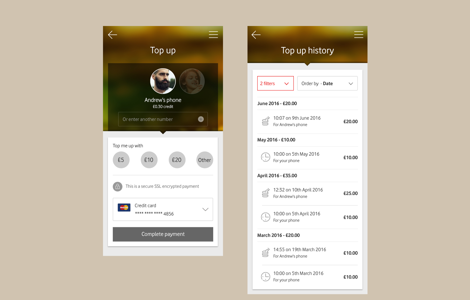
The power of data
Converting raw data into a user-friendly format can lead to data-backed decision making which is the most powerful tool today.
Know More Volkswagen / 2015

Distraction free driving
Description Lorem ipsum dolor sit amet, consectetur adipiscing elit
Know MoreTitan / 2015

India's First Smartwatch
Titan’s first-ever smart-watch, Titan JUXT Pro featuring powerful apps such as notifications, weather, calls, calculator, and pedometer on the go.
Know MoreCareer Highlights / 2007 - 2021

Designer. Storyteller. Problem solver.
Through my 14+ years of experience, I have worked on many diverse projects. From the research stage to development applying my well-rounded knowledge of design thinking and user-centered design.
In all the projects that I undertake, I seek to study and understand the gaps in the relationship between users and the interactive products they use. I believe it is crucial to step into the users’ shoes and look at things from their perspective. I realign the product against business goals and technological constraints and look for effective strategies to create a seamless and hassle-free end-to-end user experience.
Throughout the course of my career, I have always found innovative solutions through user-centric design, that goes beyond the surface to solve grassroot level business challenges. I love that my job allows me to transform the lives of users using design as a tool.
Aside from all this I like travelling, cooking, long drives, and music.
Awards
Social Media Campaign of the Year | Social Media Summit 2015
Best Use of Twitter | Social Media Summit 2015
Silver | Cyber-Microsite | Pepper Awards 2013
Silver | Branded Viral Content | Pepper Awards 2013
Project overview
To comply with my non-disclosure agreement, I have omitted and obfuscated confidential information in this case study. All information in this case study is my own and does not necessarily reflect the views of Alcon
Boosting Alcon sales through data driven solutions.
Think of unstructured data like a diamond in the rough. Unless you work on it and give it shape and structure, it is a wasted resource. But tap it into a consumable form from which you can draw actionable insights and you have hit gold! Data-driven decision-making helps validate your course of action, thus, creating a fool-proof plan for success
And Alcon recognized the gap in their system and wanted to empower the surgical sales team to make data-backed decisions. The goal was to reimagine the sales and marketing dashboard as a visually appealing, easy to use tool by innovating and pioneering new ways of integrating data and insights onto their screens.
My role
I was part of the COE team and was responsible for the user experience strategy and design execution of the Alcon Sales and Marketing Dashboard.
I lead the UX work, producing all major deliverables and presented these to the client between Sep 2020 and April 2021. I worked in tandem with the development team to achieve desired quality standards in usability and design.
Discovery
How it all began
In early 2018, we launched the inaugural version of the SG landing page which was then renamed to Alcon Sales and Marketing Dashboard - a hybrid version of Tableau and HTML. The landing page basically projected insights on the screen which in turn enabled sales reps to make data-driven decisions.
Early insights
Understandably so, being in its preliminary stage, a lot of key elements were still missing. The dashboard lacked features, functionality, simplicity and personalisation. It was certainly not easy to use and it was impossible to draw quick data inferences.
So my team and I got to work. To get a deeper understanding of the gaps in the system, we conducted a survey with a total of 189 medical reps to understand the efficiency of the Sales and Marketing dashboards.
And this was what we learnt:
- 75% of users accessed the portal daily or at least 3-4 days a week
- Users needed frequent training to understand data and the functionality
- The portal lacked flexibility and the users found it difficult to use
- Huge scope of improvement in terms of usability and scalability
Defining a holistic goal
The survey results strongly indicated that the users trust the data on their screens. So the sole focus now was to make the landing page faster, more mobile-friendly, and user-specific. Our mission was to ensure a hassle free-experience and empower users to easily manoeuvre the application with the least number of clicks.
Decrypting the end user
And this what they say
“There are many different places (Tabs, Sites etc..) that you need to get information. A sales dashboard should be easy to navigate”
"For a sales rep to be motivated. They need to know that when they switch a customer to a new product or raise a price. the rep should know that is going to impact their commission positively or negatively"
"It takes a long time to get the info I needed. I can see it is there, but it isn't a few clicks"
"Very difficult to find detail customer info (What they order, order patters, contracted price etc..) Also, too many filters to get to useful info - you know who I am when I log in, take me to my territory info."
“It takes sometime time to load the data. Can we make it quicker to respond”
The feedback button
A first-hand experience can directly influence the next set of actions which can help create a seamless experience for the end-user. And that’s why I initiated that we plug in a feedback system in the form of an 'Improvement Request' wherein any user would be able to share their feedback with the business head.
And boy were we glad that we did! The results were incredibly insightful.
Simplicity is the ultimate sophistication
When we analysed the data, we found major flaws in the current system apart from the ones found in the survey:
- User groups were different. Hence, this wasn’t a ‘one-size fits all’ situation. A single template of UI might not fulfil all the users’ needs
- The user was interested only if the data was updated
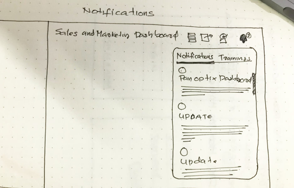
- Training was important from a business standpoint, hence timely notification from the system to the user was critical
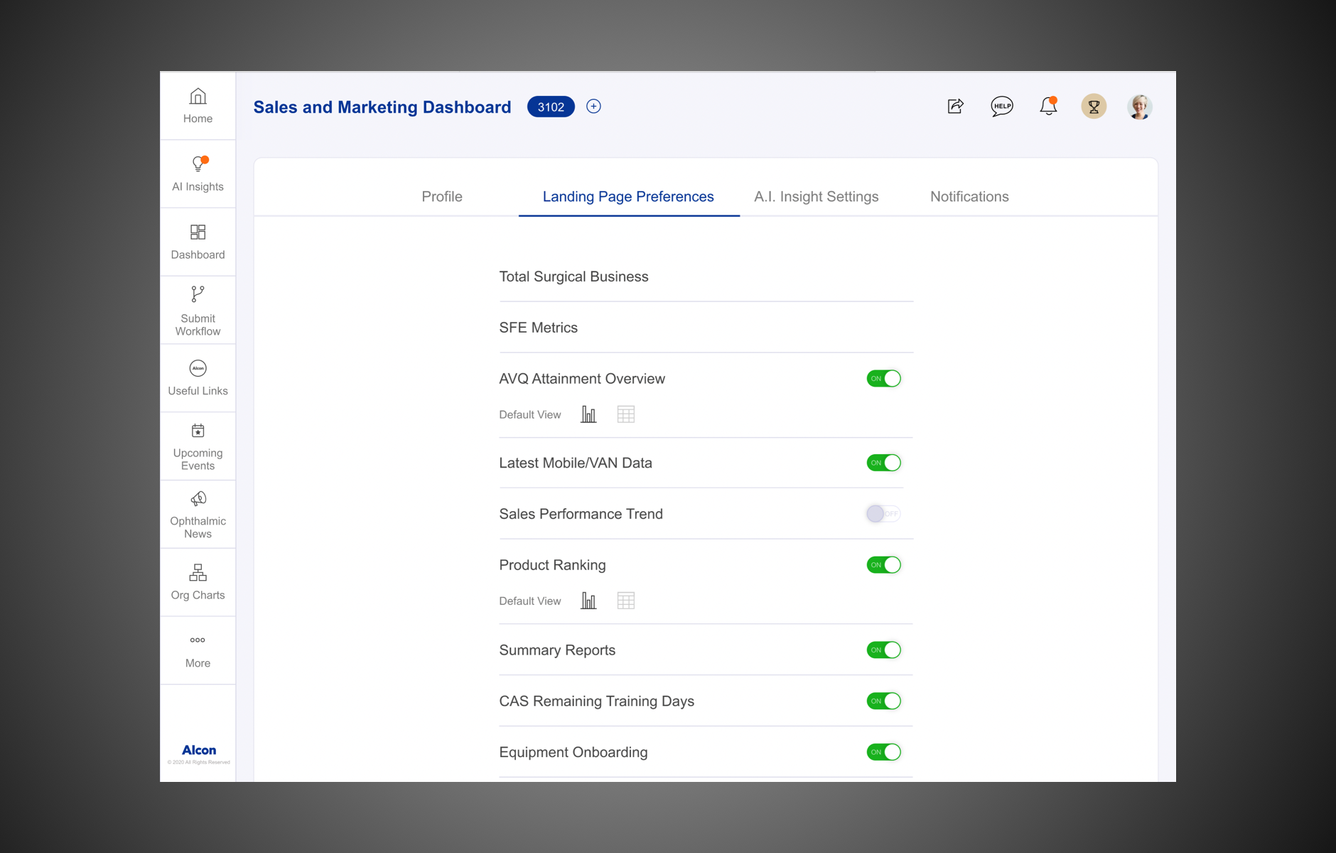
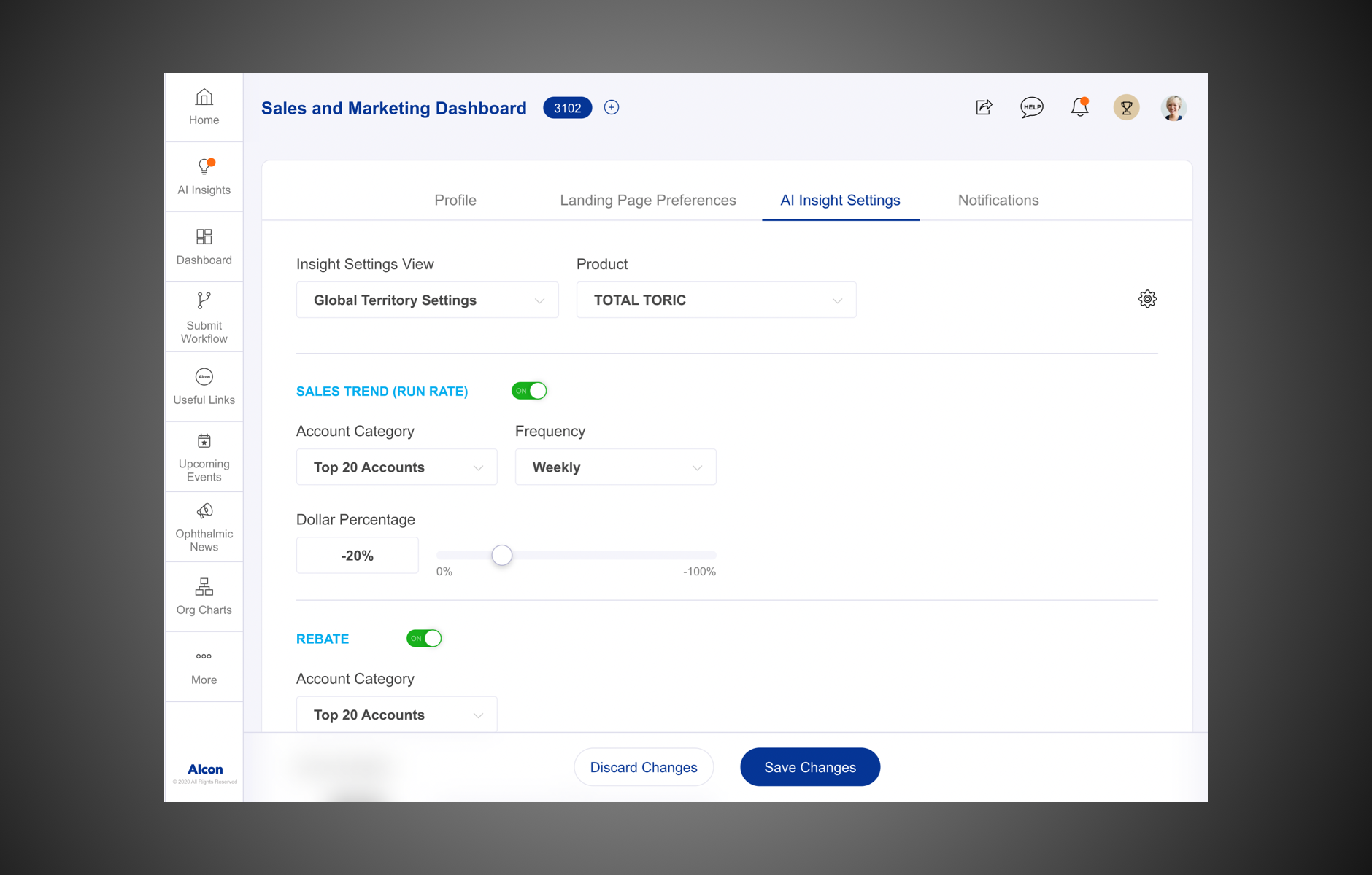
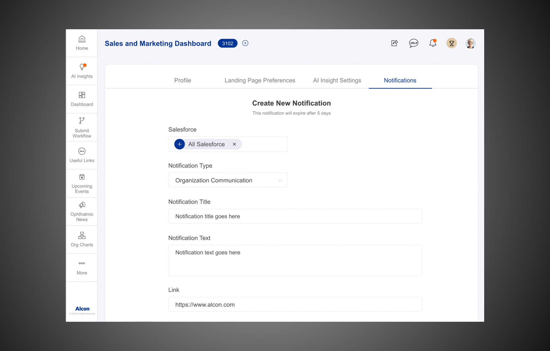
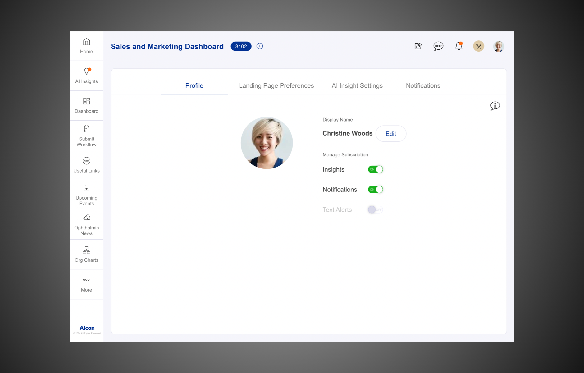
- There was too much information populating the screen on the dashboard. The users wanted crisp summaries which on a single click would lead to more elaborate and comprehensive explanations
- Ability to share the content
- Ability to compare different territories (compare different sales reps)
With all the necessary data in hand, the Program Manager, Technology Lead and I sat together to brainstorm. Together we identified risks and aligned on expectations and constructed a shared vision for the portal. Following this, I crafted an experience strategy.
Design
One step forward, two steps back?
On our weekly sync with the Business head, he expressed his urge to complete the first phase by early 2021.
This was certainly a big challenge for us as we had a very stringent timeline and a small team in hand. But as the design lead, I also did understand that it was important to have everyone’s best interests in place - the business head’s and my fellow teammates’. And so, we went back to the drawing board to analyse what could potentially be projected as the MVP in the first phase.
A need for speed
For the user to have the best experience possible, a fast and responsive interface is extremely critical. Our current infrastructure was quite slow and was not compatible with the layouts of iPads and desktops, which were the devices of choice for most users.
And so we knew it was high time to make a strategic move and adopt modern development standards.
We migrated from hybrid to java and the results were great. Compatibility was successfully tackled and it proved to be a scalable model as well. The restructured data lake would also provide adequate speed for the users especially when they were on the move.
Testing the waters
Now that we were clear about the improvement areas on the current landing page, the next plan of action was to create a high-fidelity mockup as quickly as possible based on the findings and to test it with real users.
Below are some key improvement points that were to be incorporated:
- Needed to be relevant, seamless and beautiful
- Mobile-friendly and iPad compatible as the majority of users access the app from these devices
- Better navigation
- Flexibility for personalisation
- A new platform that we can build upon
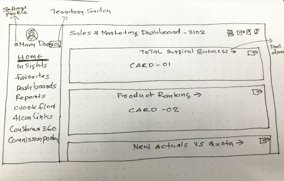
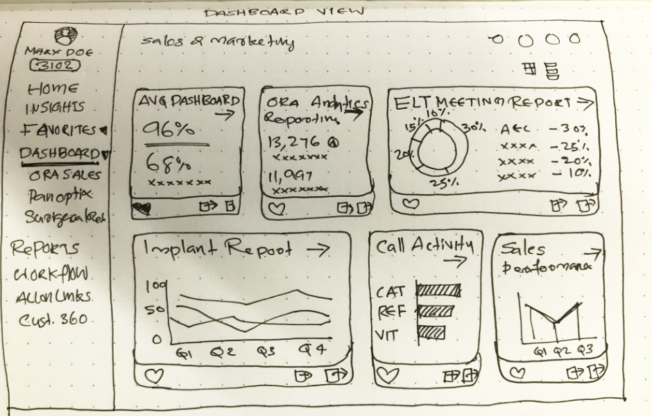
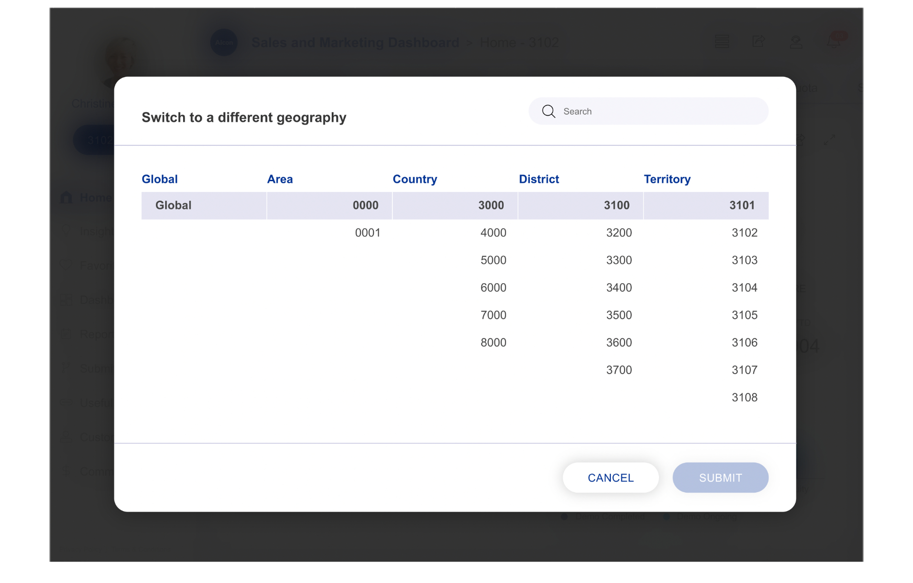
Based on the expectations from business needs, survey results and feedback, we came up with the following information architecture.
Walk a mile in the users’ shoes
I believe that the best user experiences are created only when you ‘step into their shoes’ and understand their perspective. So I went back to the drawing board, and made some rough sketches which allowed me to step into a medical rep’s shoes and identify their pain points and focus on improving their end-to-end experience.
The key is to not forget the ‘high-level goals’
At the end of the day, the goal was to create a dashboard which enabled users to quickly and easily consume the data on their screens. And for this, I drew quite a bit of inspiration from Tableau blogs and insights from Google Analytics.
User Testing
Time to gain some validation
Once we were ready with our initial mockup, we prepared for the workshops. Ally, a fellow UX designer had joined our project from the US to help me conduct workshops since 1 out of 3 sessions were in late IST.
This is how it worked:
- 15 recruited participants
- 3 moderated sessions in groups of 5
We used the white-boarding tool 'Miro' to conduct our workshops. The photo below shows the expectation for the sessions.
We started with a quick ice breaker to familiarise the participants with Miro. We then asked them to express their expectations on the redesign without showing them our redesign mockup.
We then revealed the new design to the participants and asked them to now share their feedback and tell us what they think.
The findings
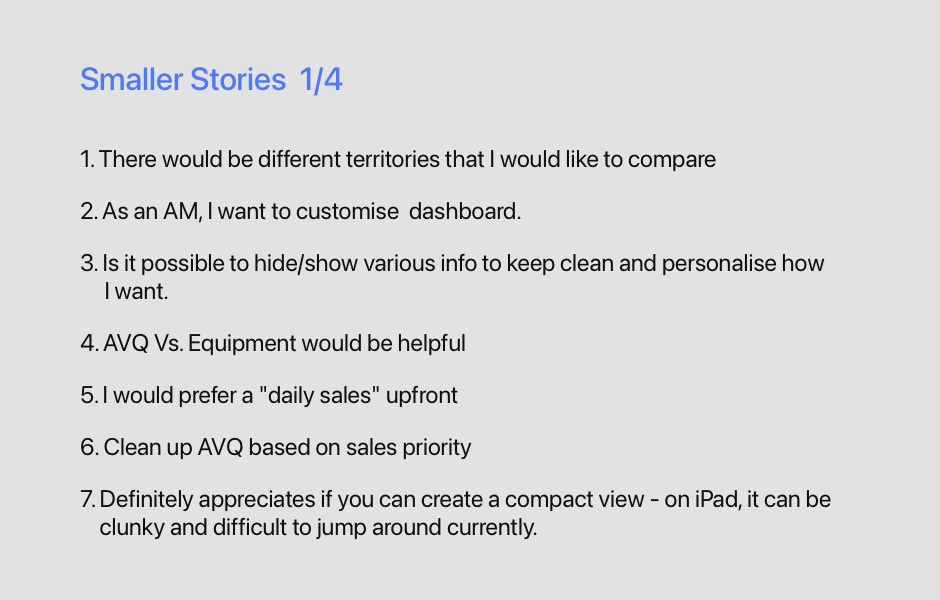
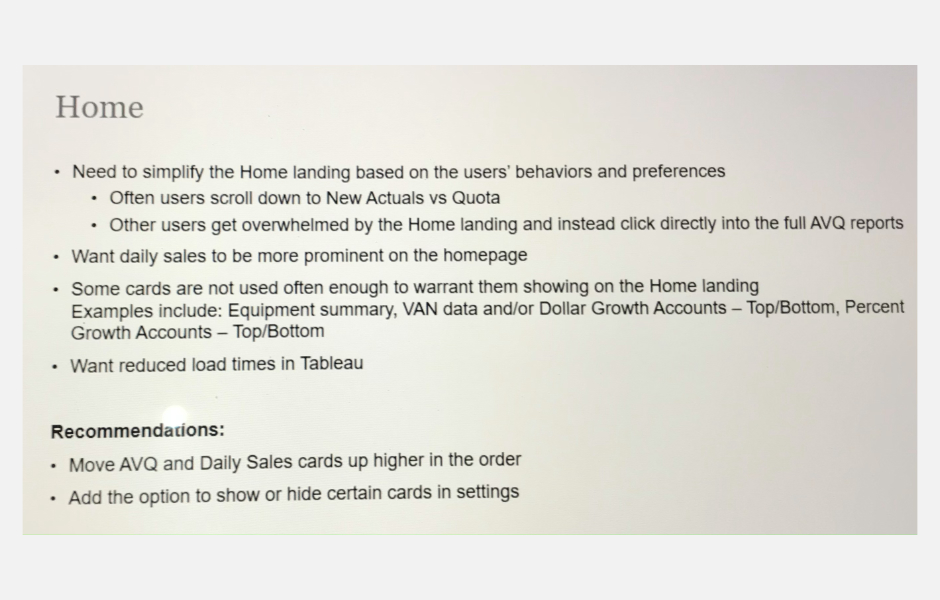
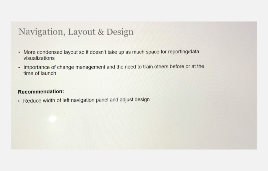
As I said earlier, feedback always helps mould the product into better shape. After three continuous back to back workshops with different user groups, we had collated very valuable feedback from our participants. We summarised our findings into the following key takeaways:
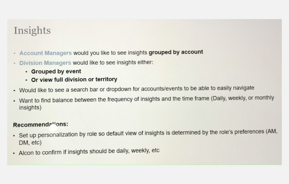
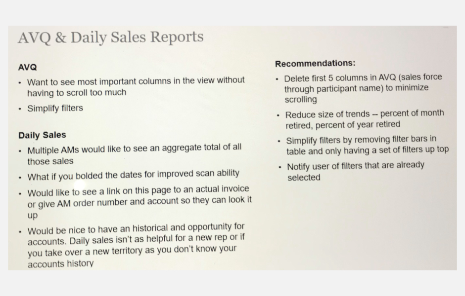
- Clean and simple design with the minimal level of difficulty to access relevant information
- CWant to maximise space allocated for data visualisations in order to limit scrolling
- Account manager prefer to look for account-specific metric and trends
- Division managers are more interested in the general health of the larger territory or division
In the constant pursuit of pushing the limits
As we regrouped with the findings and dove deeper into user feedback, we realised we wanted to push the boundaries and work further on hyper-personalisation and flexibility. I went back to my XD file and started incorporating following considerations:
- Improved settings and profile section for better customisation
- Highly customisable insights
- Customisable notifications for admin users
- More space for data - to allow full-screen view for data cards
- Summarise the views/ reduce filters
- Role-based information hierarchy
- Motivate the user based on their performance
- Simpler way to ‘favourite’ dashboards
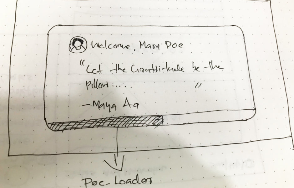
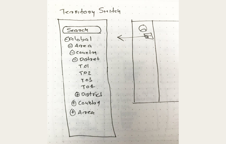
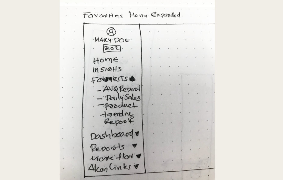
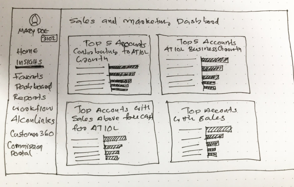
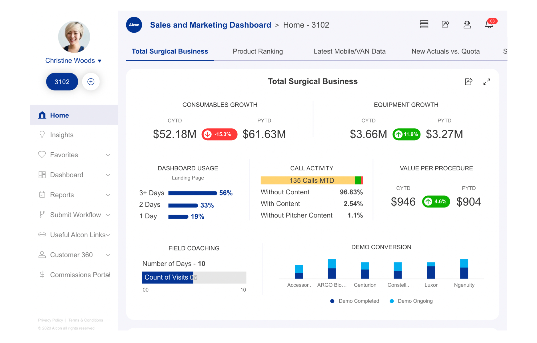
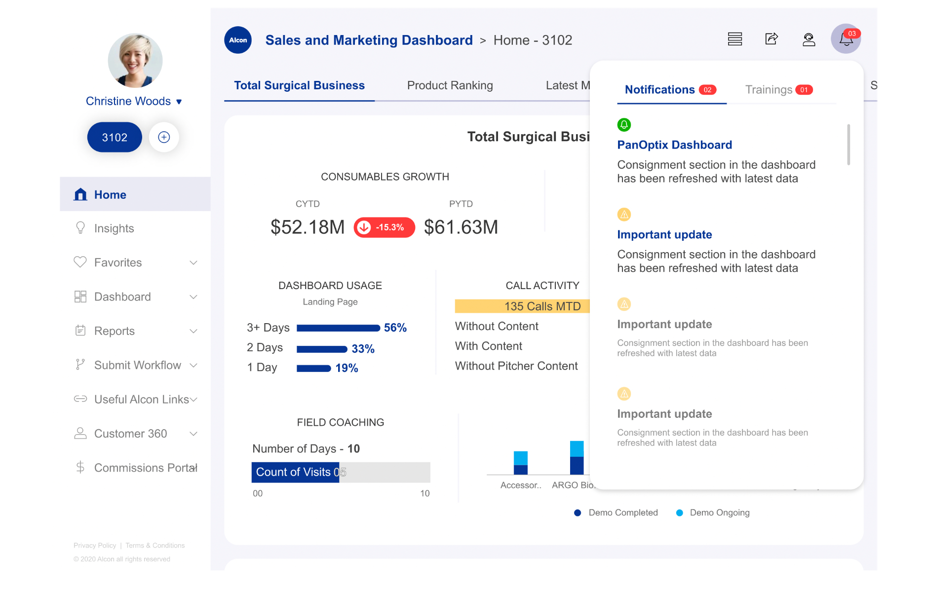
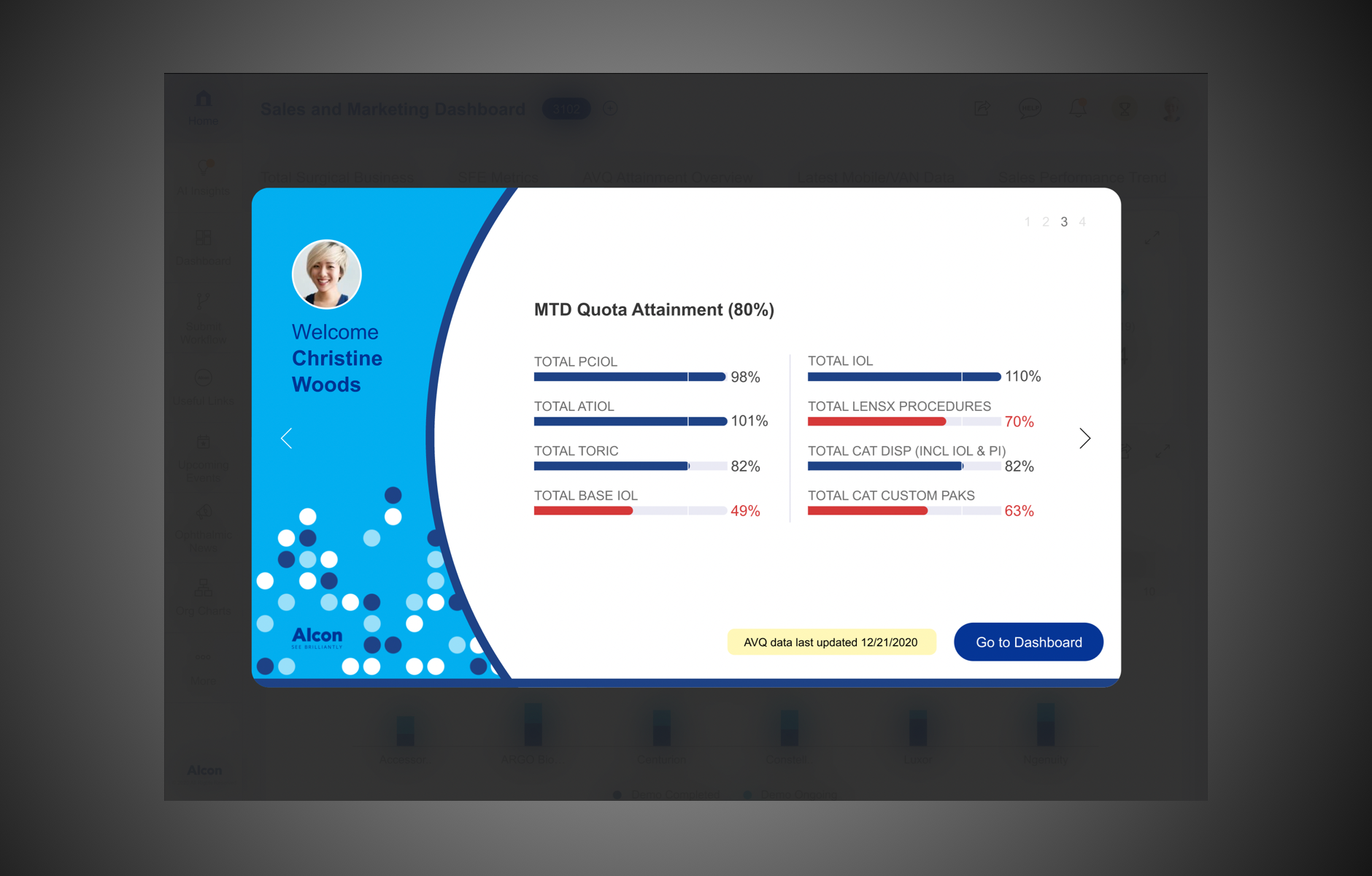
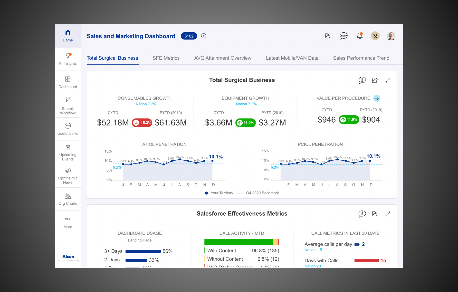
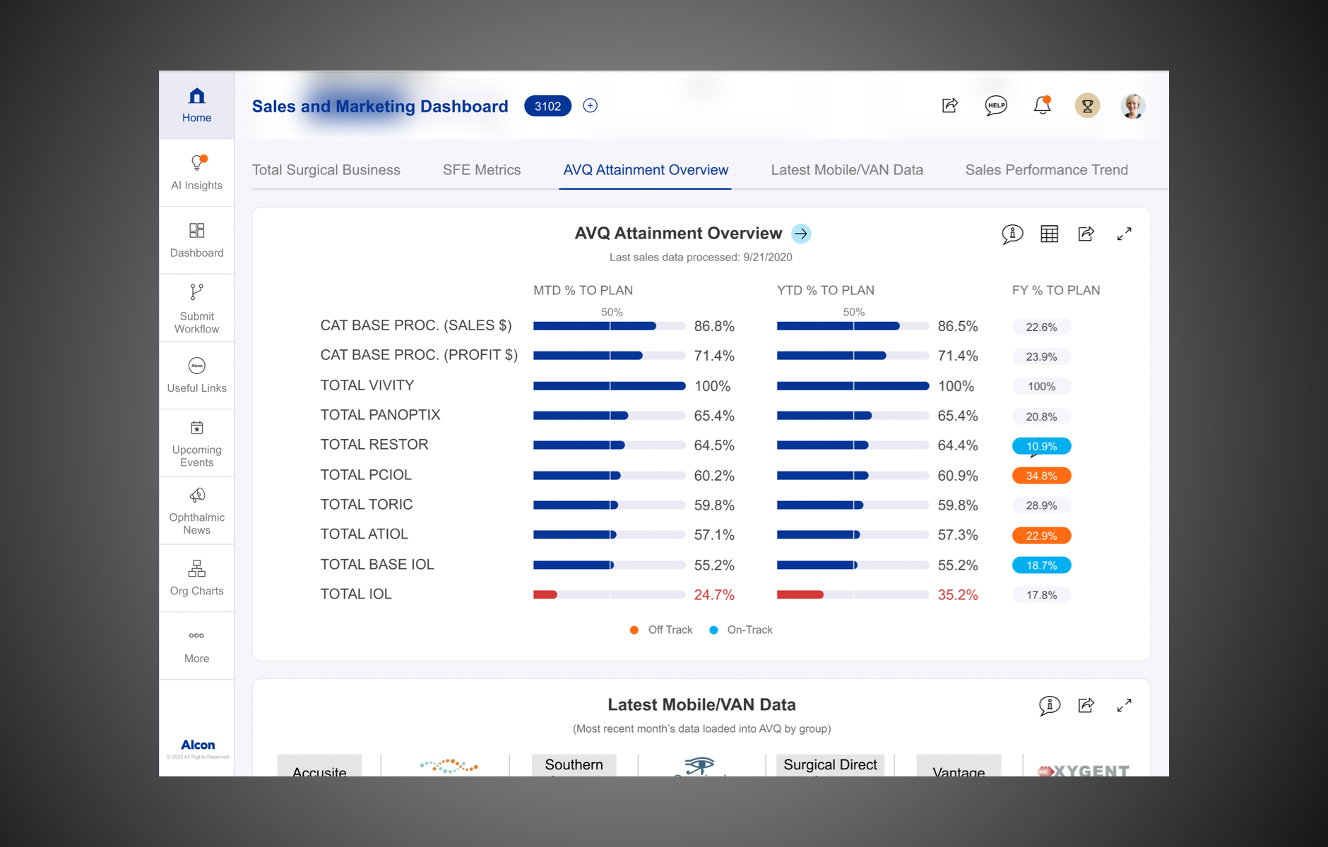
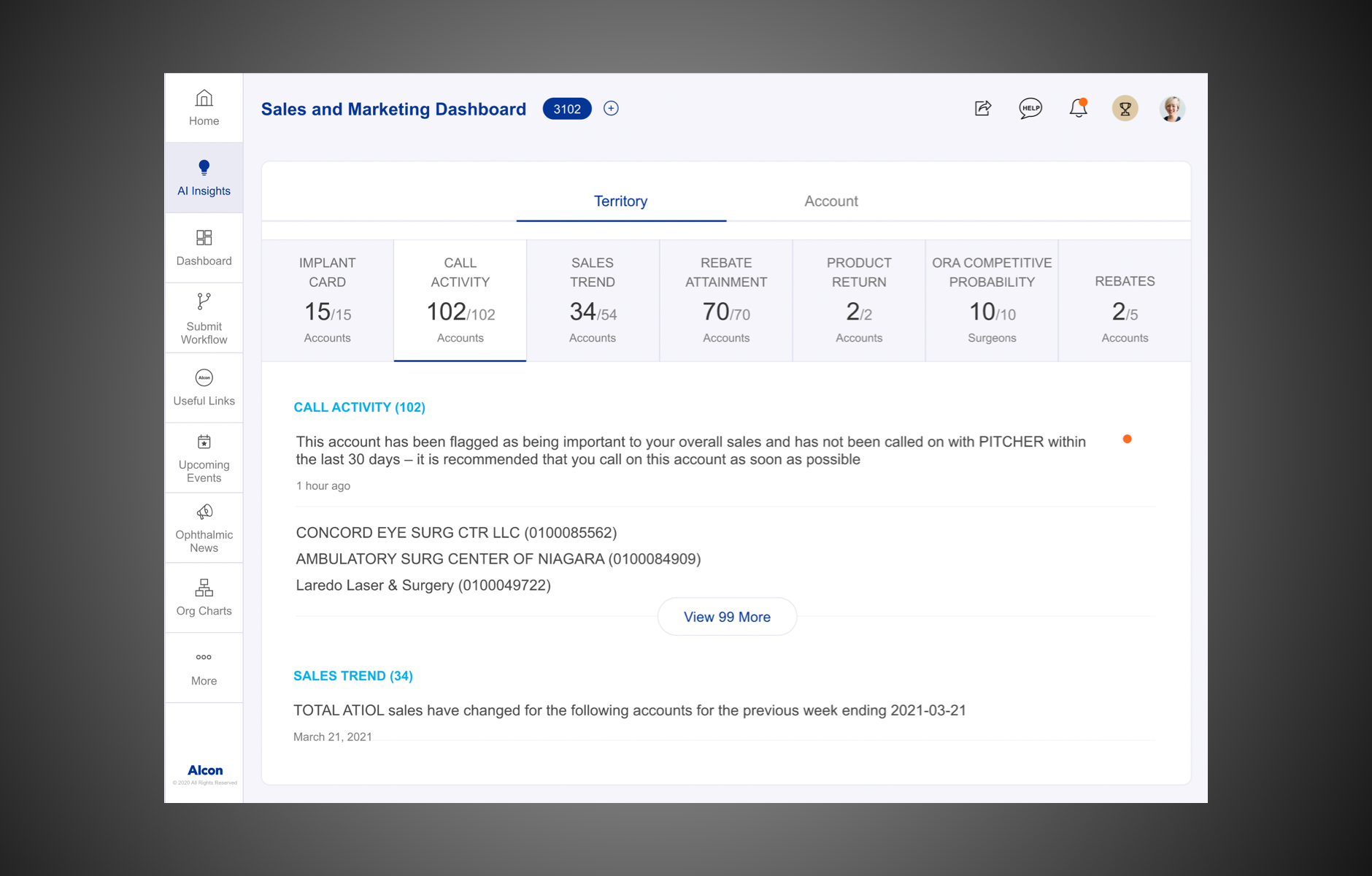
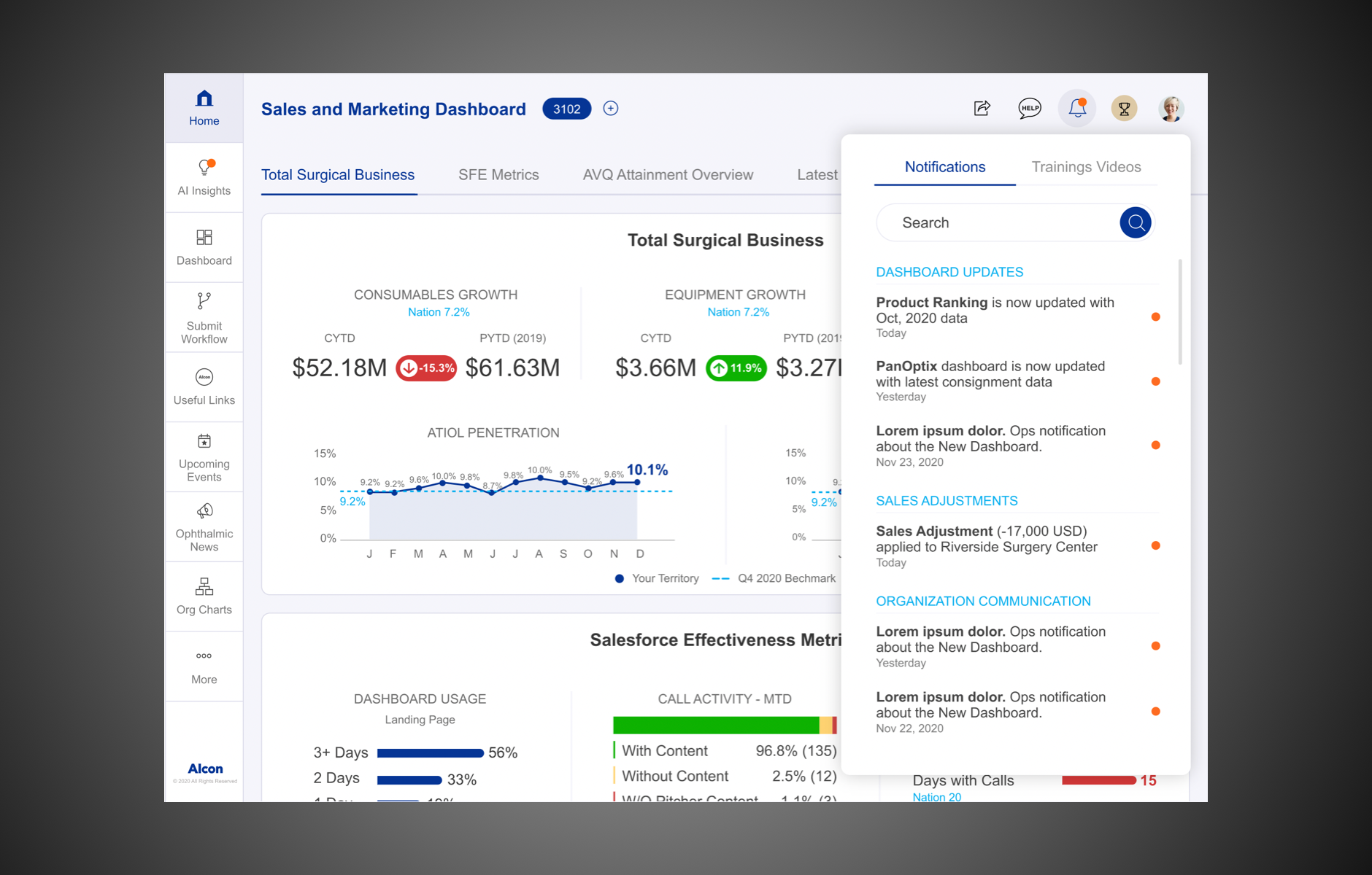
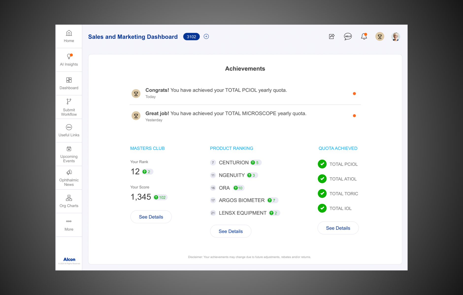
Here are some screen shots of the final VD:
Developer Handoff
Staying true to my work ethic
Usually, for a UX designer, once the deliveries are covered, the next project comes along and we move onto that. But projects for me aren’t just targeted assignments but essentially real-life problems that we need to solve with a design acumen. And that is why I always stay until the development stage to ensure the highest standards of quality are maintained and the user has an incredible experience.
And that is why I wouldn’t be lying when I tell you I am proud of this project. It was certainly a massive feat that a small team of 8 had created a customisable dashboard with massive volumes of data (we consolidated 10+ dashboards into 1). Within just a short span of six months of design and development, we transformed it into a hyper-personalised and scalable dashboard which enabled users to reach the relevant pages with minimal effort.
It is live!
We have been receiving overwhelmingly positive response from all over! We have still kept the 'Dashboard Enhancement button' open for suggestions. But we are receiving positive feedback from all the users describing the app as simple, intuitive, and easy-to-use.
Measure
Measuring the metrics of success
As it has just been launched, we are still measuring the success rate. Though I don't have numbers to show right now (which I’ll be updating soon), we have been told that the internal community is now stronger than ever, having been empowered with so much data to now drive strong decision making in the coming future. It is exactly this which makes all the work worth it.
A personal initiative
As it was a first of its kind project in the team, I also took up the additional responsibility of creating a design system. This initiative I knew would eventually help my fellow designers in the future considering 20+ dashboard would be migrated to a similar structure with the proposed visual language
My learnings
Steer away from bias
When you first enter a project it is very easy to be swayed by the numbers and the financials and be biased by the business interests. But as a designer it is of paramount importance to remain neutral so your product’s goals and vision remain undeterred. It is the designer’s responsibility to take into account, everyone’s best interests and produce a product that satisfies everyone.
Strategic scheduling of workshops
In hindsight, we should have spread the three workshops across three different stages. One after the survey findings, the second one as a usability testing after the redesign, and the last one at the end. This could have yielded better insights into how user experience has evolved from beginning to end rather than having three workshops back to back.
The power of data
Large volumes of unstructured data can be cumbersome and difficult to decipher, but data is incredibly powerful. Charting a clear roadmap defining the business objectives, functionality, end goal, and giving it the requisite structure can add significant value to the business. Scanning multiple excel sheets might sound tiring, I get it. But putting all that raw data into a user-friendly format can lead to data-backed decision making which is the most powerful tool today!
Thank You for your time!
Introduction
To comply with my non-disclosure agreement, I have omitted and obfuscated confidential information in this case study. All information in this case study is my own and does not necessarily reflect the views of HTC or Volkswagen
Distraction-free driving aid
It was the year 1986. The first infotainment system had just been introduced and instantly took the world by storm. By the early 2000s, it had become so popular that it was increasingly difficult for manufacturers to produce a car without them. And today, it has almost become indispensable. You cannot spot a car without one.
But by integrating funky attractive infotainment systems, are we distracting the driver from the road and compromising his safety? Unfortunately, the answer is YES.
And that is why Volkswagen and HTC joined forces to create an application that will provide the best-in-class experience to the driver without compromising their road safety.
The Problem
Defining our goals
HTC Customer Link intended to sync with OBDII dongle and various cloud servers to fetch information. Using this unique technology, users would be able to find freeways, locate their car, receive car manufacturers’ offers and handle any emergencies, make service requests, etc.
The Aricent design team had expertise in design and research and so my team and I were looped in to develop interaction design for Android and iOS.
The app was slated to go through a blindfolded usability test process in order to pass the CCC certification. The app officially launched in Taiwan and some parts of Europe by mid-2016.
My role
I was the UX Lead along with a Visual Designer and Design Manager, with whom I collaborated in this project. I was part of the project from the initial workshop until the handover of the project to HTC.
Discovery
Dissecting the tech, trends and market
And so I began my extensive research about car infotainment systems, the evolution of its technology, and changing trends over the years. I believed it was also equally important to understand the human psyche and their user behaviour. The very need to create this tool was because users were being distracted from the road.
Why? Because smartphones have unfortunately become the very epicentre of our lives and we cannot go a minute without peeking into our phones for work and personal updates. In fact, at any given time throughout the day, approximately 660,000 drivers attempt to use their phones while behind the wheel of an automobile. According to stats, this distraction resulted in over 390,000+ accidents every year. This HAD to be solved.
I mostly learnt by watching videos and was genuinely surprised by how informative some of the YouTube car reviews were. All this research equipped me with a deeper understanding of these unique systems and paved the direction for the project as well. I even created a PDF with all my learnings- identifying the gaps in the market and highlighting the pros, cons, the best performing models and other trends.
Stakeholder Workshop
The app was going to primarily be launched in Taiwan. So, David Lee - the project owner flew down to educate us about these handy indispensable auto-tools and also to help us understand the user personas.
Since the concept was already in the market in many forms, the objective was to create a seamless, safe and smart user experience by gaining deeper insight into user behaviour. And thus began a week-long workshop with the target group through inputs provided by David. By this time I had enough data to get started with my work.
Key Insights from the workshop
David explained the significance of infotainment systems in Taiwan and the common sentiment towards them. His insights were based on data drawn from social media and a few auto forums. Turned out that people weren’t using it much apart from the music library due to its laggy and non-intuitive interface.
Understanding the user personas
David showed us a video of the actual users using the existing infotainment systems in Taiwan and a small interview highlighting the same.
Based on this, we arrived at a target audience. I am glad we did this step because these profiles helped me later too when interacting with developers.
Tackling the all-consuming smartphone
Of course, this was the biggest challenge! All of us being natural phone addicts, can’t help but be distracted when behind the wheel. This clearly showed us the difficulties in multitasking while driving. And these mishaps could potentially cause accidents. Our research also showed that most of the time, users accidentally touched buttons and ended up losing their way.
Alex Autos, a youtube channel, which provided me with a lot of insight into the users’ pain points when driving, their preferences and helped me strategise solutions.
Prioritizing the pain points
By this point, we had identified and prioritised features like Emergency, Phone, Music and Home screen widgets, display of OBDI info as the primary paint points which needed to be addressed in MVP 1. As a second phase, we were taking up the following features in order of priority: Messaging, Gas station finder, and Settings.
We presented two Interaction directions. The task flows were created based on chosen directions. Some key points that were considered:
- 3 taps at maximum on any tasks
- Fluid and intuitive interaction
- Focus on findability and legibility
Mirror Link & Car Connectivity Consortium
The workshop also discussed that we need to adhere to the CCC guidelines and dos and don'ts from the Car Connectivity Consortium. It was amazing to see the amount of research that had gone behind creating their guidelines. In other words ‘lifesavers'
Solution
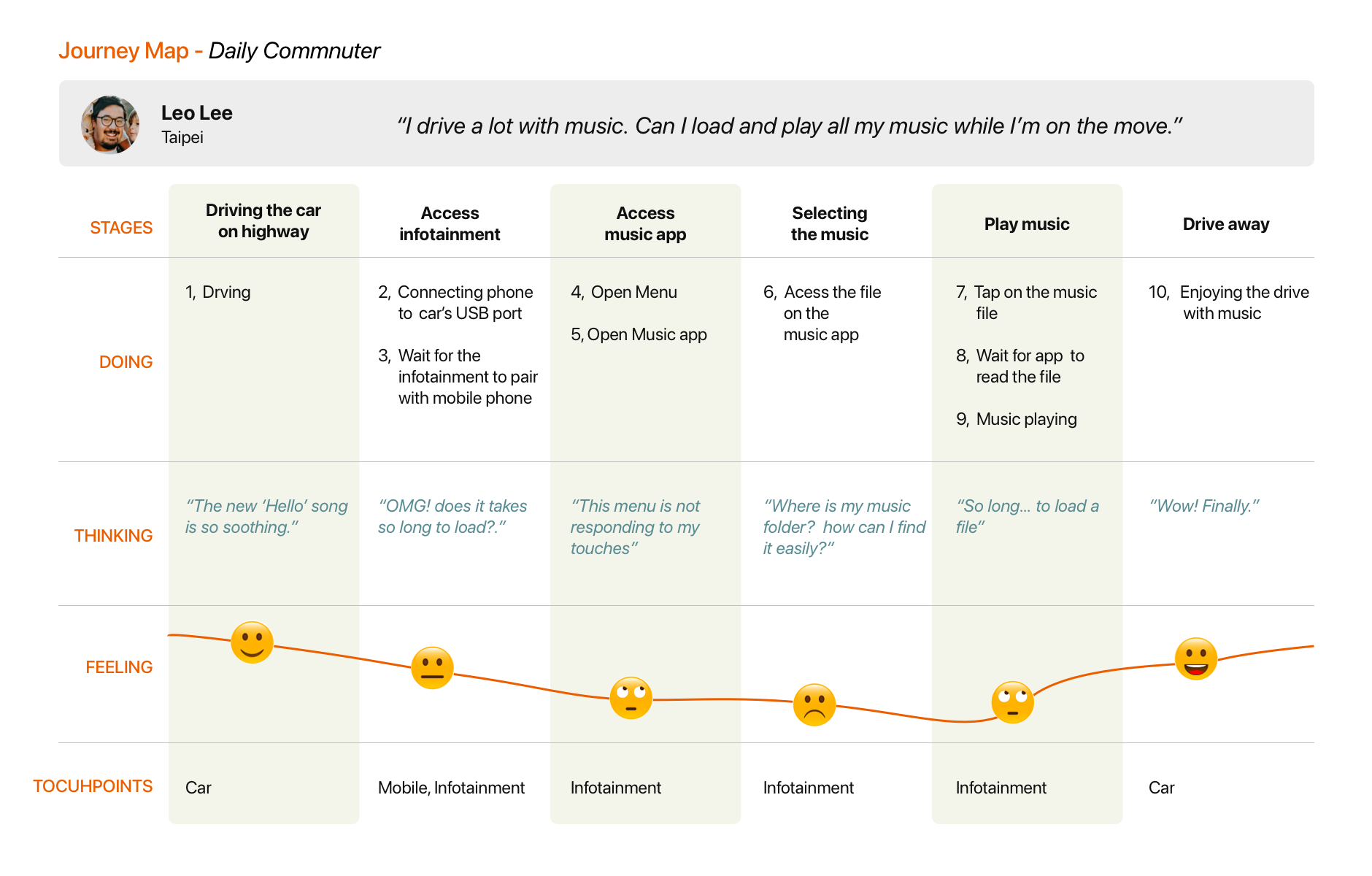
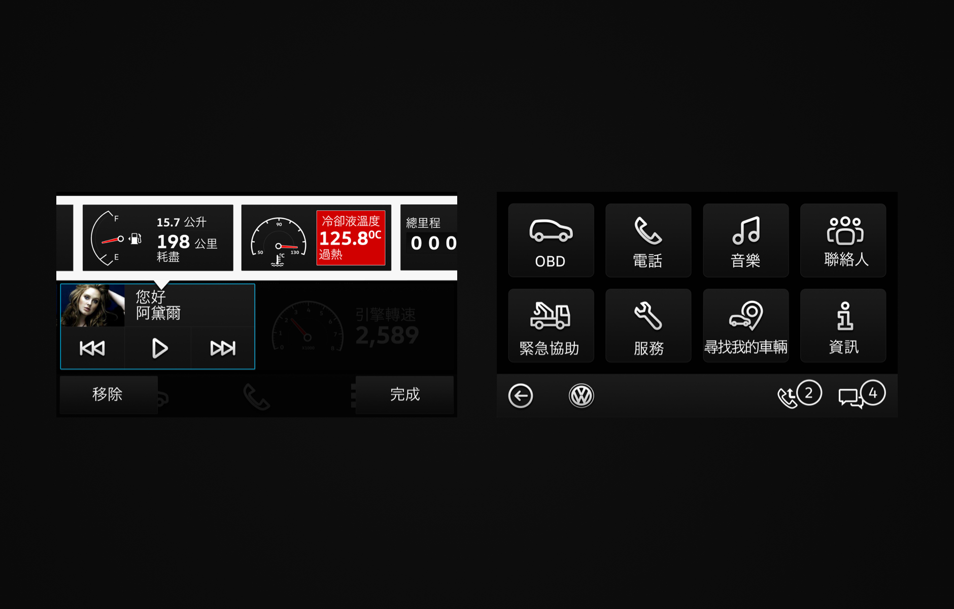
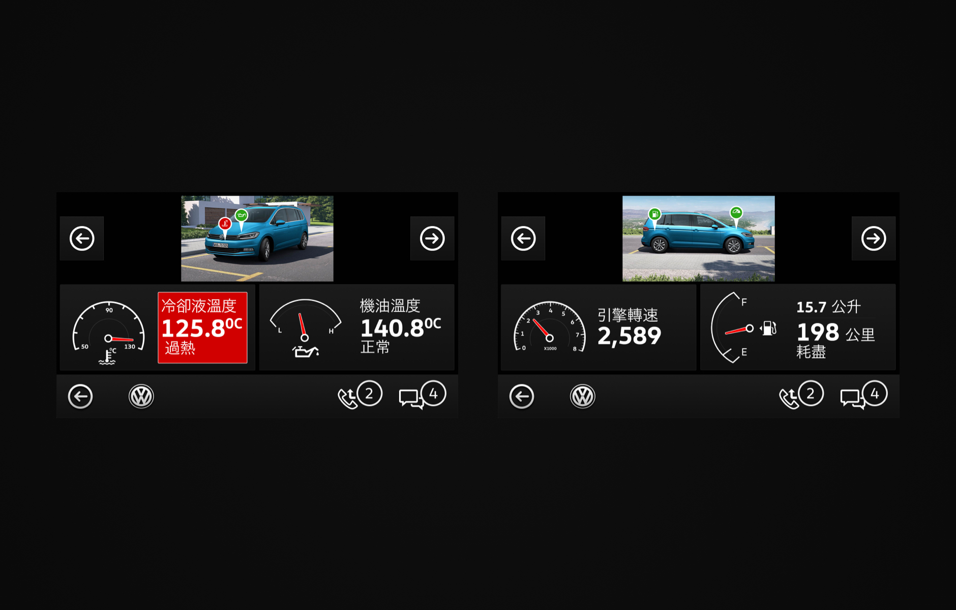
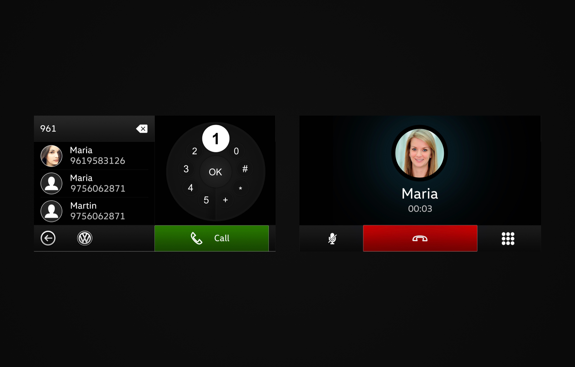
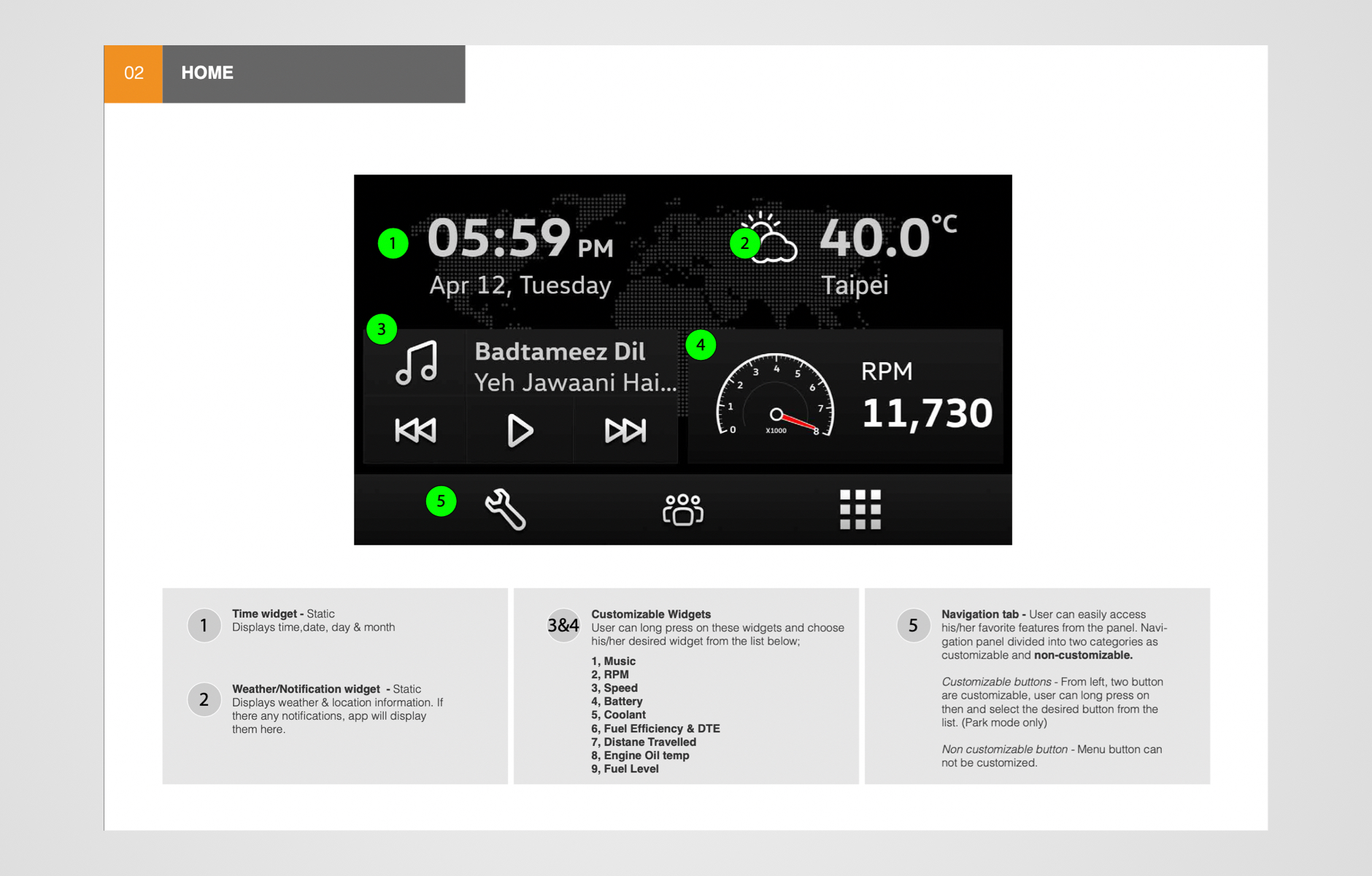
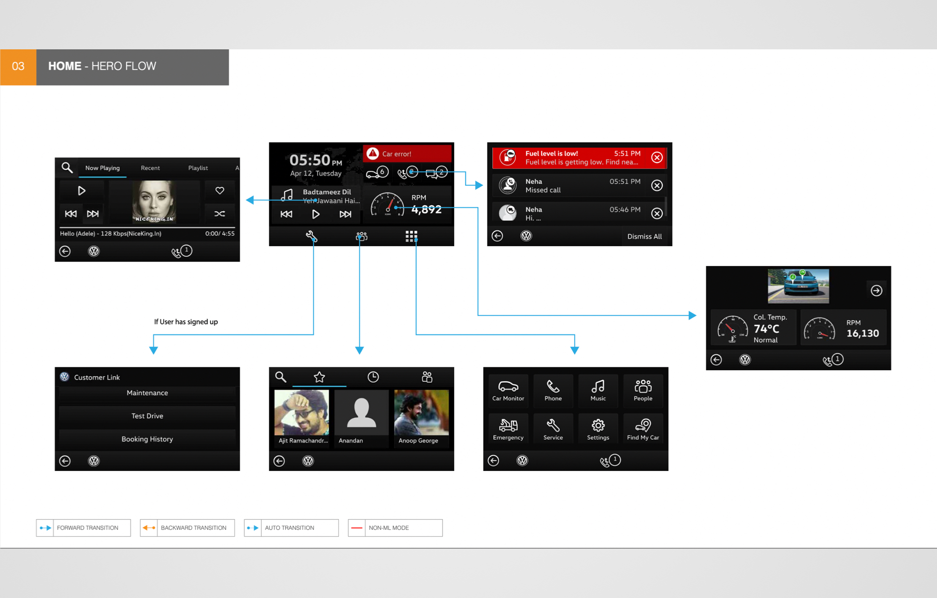
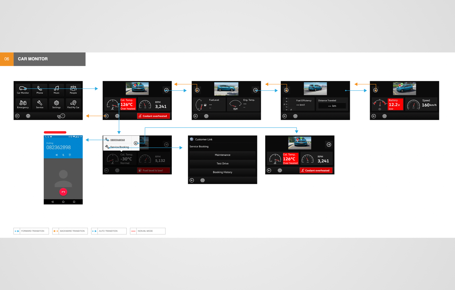
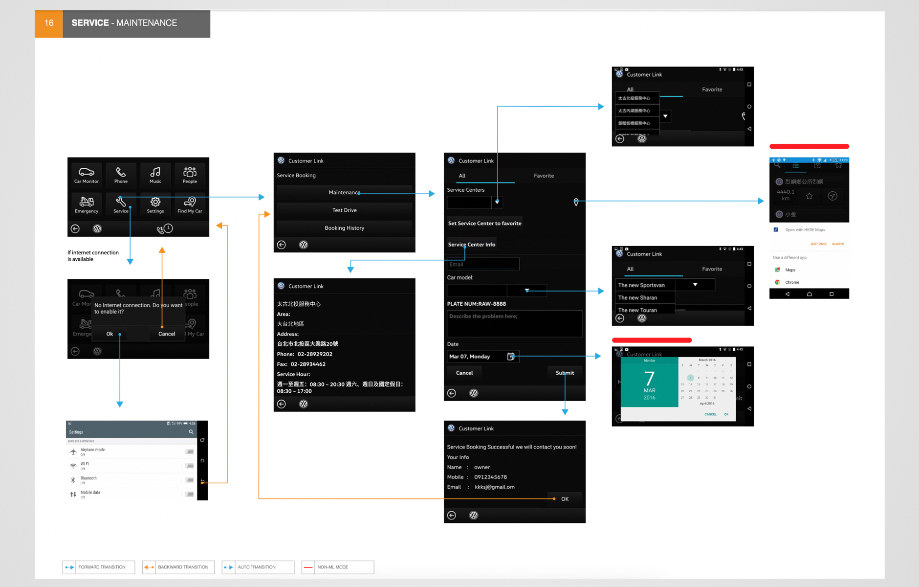
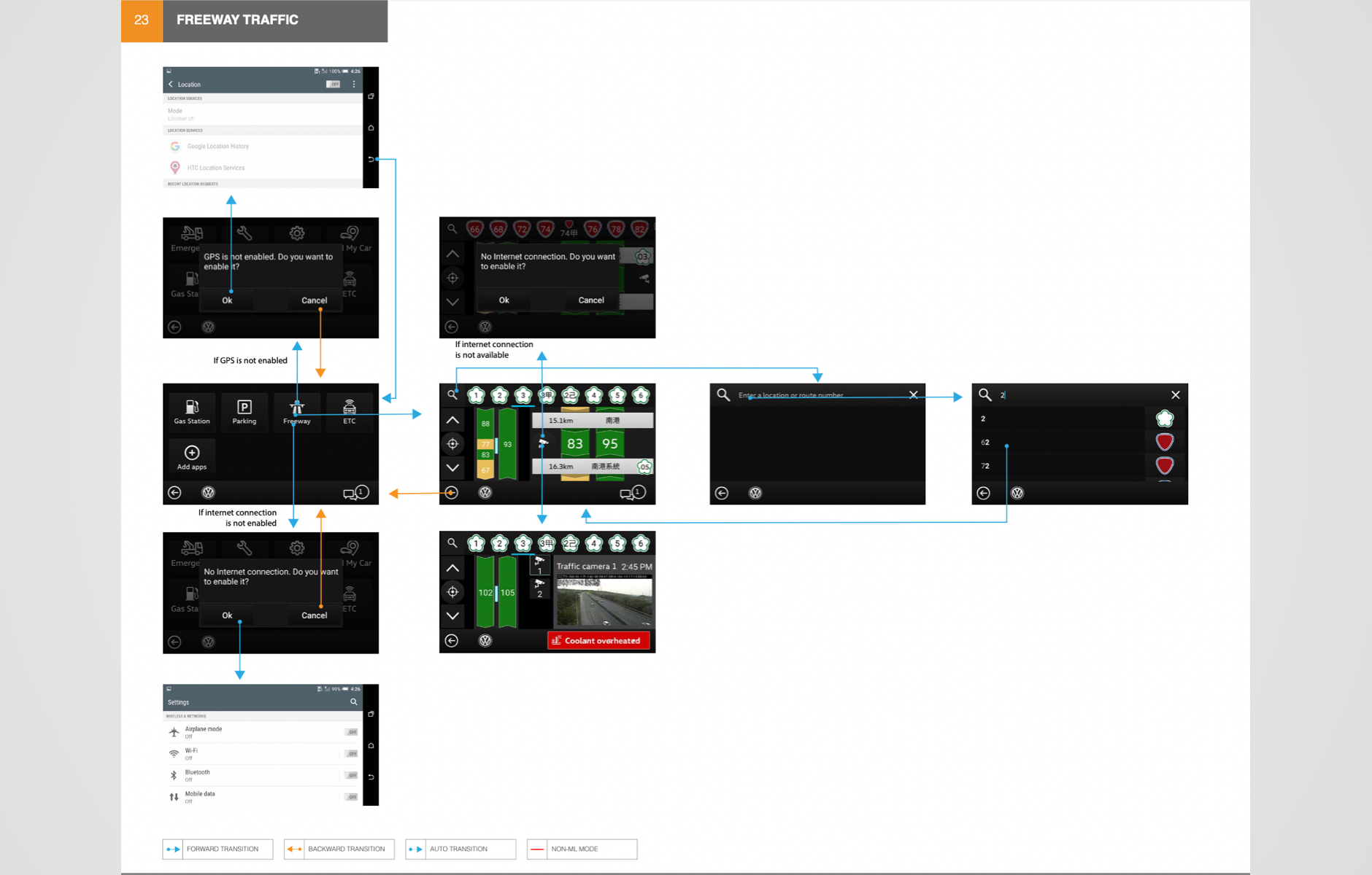
1. Hassle-free navigation
90% of navigation was made possible within 3 clicks. This enabled the driver to seamlessly navigate the app and the road while driving in any condition.
2, Easy customisation
Users would be able to customise and personalise their home screens according to their preferences. This eliminated the risk of not being able to find what you needed while the users were on the road. This feature was made available in parking mode too, considering the occupant’s safety.
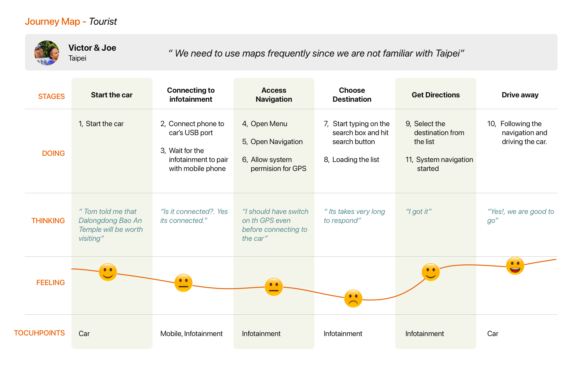
3, Notifications
Users would get notified about all the important updates right on their infotainment home screen. This automatically translates to hands-free driving- not having to pick up your phone as your system will now show you all your important messages, calls, and OBD alerts.
4, Drive mode
Some of the apps would smartly be disabled while the user is on the move to prevent being distracted behind the wheel. This would automatically help reduce the chance of accidents on the road.
5, Rotary Knob
A few models in the Volkswagen lineup had a rotary knob to control the screen. Taking advantage of that, we incorporated certain navigation patterns.
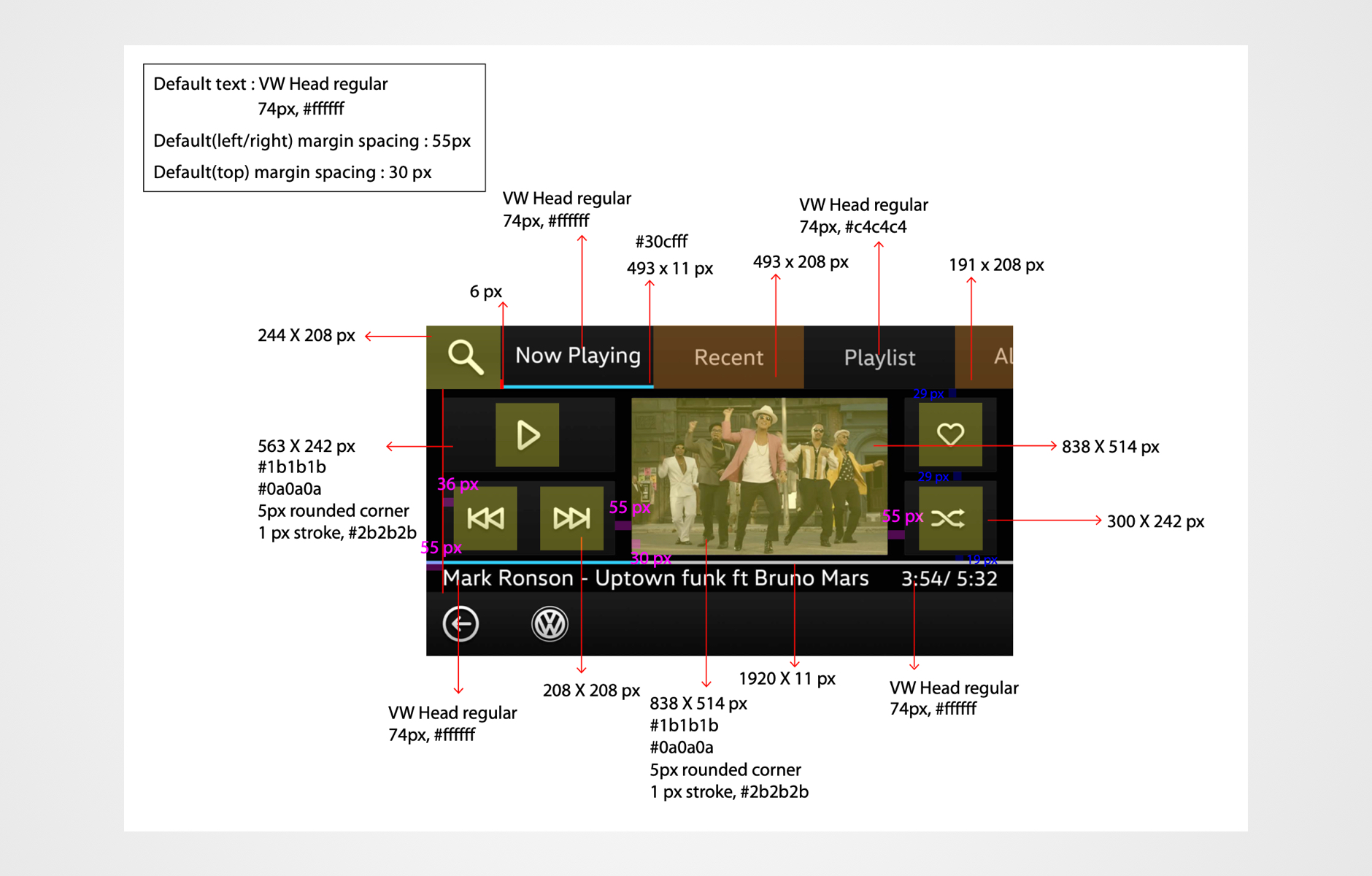
6, Music App
Initial research showed us that the majority of users were using the music app more than any other feature. Hence, we decided to enhance the experience by creating a frictionless and intuitive experience. My fellow engineers played a pivotal role here to make it much faster than anticipated
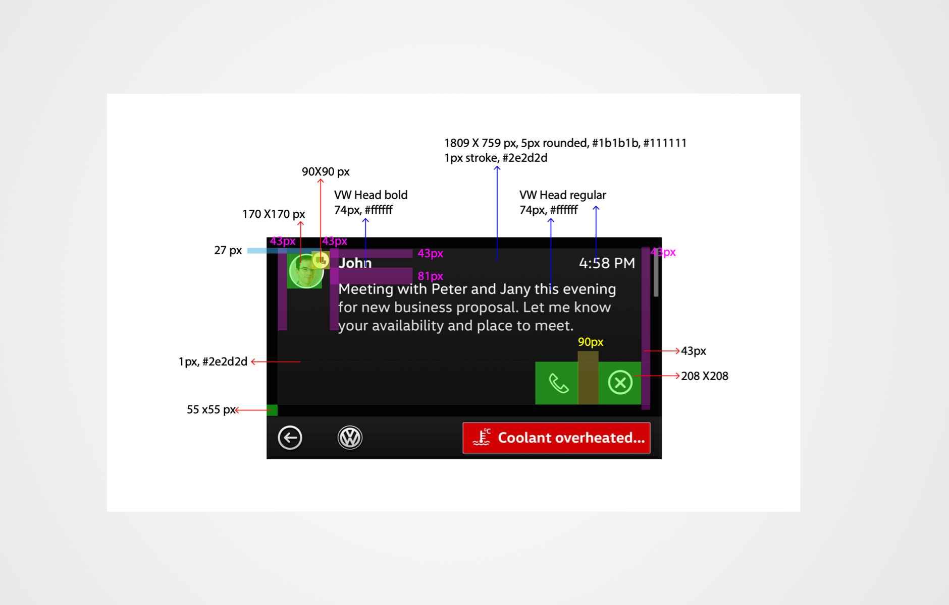
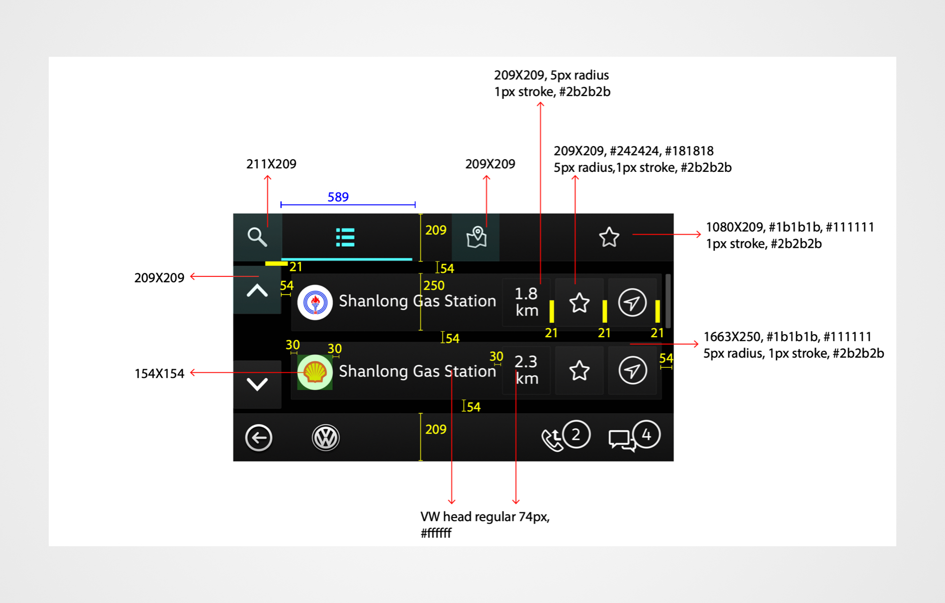
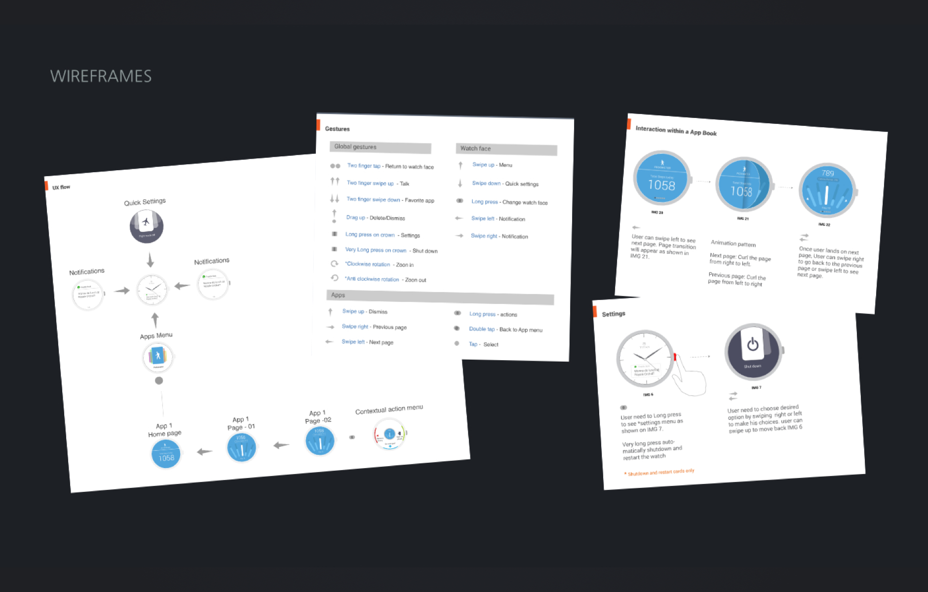
The document below will provide extensive insights into how we approached the interaction pattern.
Visual design
Perfecting Pixels
David and the team were happy with our progress so far. And so, I began working on the visual design. The CCC guidelines provided extensive information on what needed to be done to pass the validation and blindfold test.
HTC upholds the highest standards for quality work as it catered to a large audience just like Volkswagen. And to work with these two giants, I had to strictly comply with CCC guidelines as well as fine-tune the design to their standards. I worked with incredible attention to detail and constantly pushed myself to innovate and create a product that was cutting-edge.
Since the project managed in Agile, I regularly connected with David to discuss the work done in the modules. Despite his busy schedule I truly appreciate the fact that David always made himself available and connected with me regularly to discuss and confirm every module. This certainly helped speed up the process and meet our deadlines.
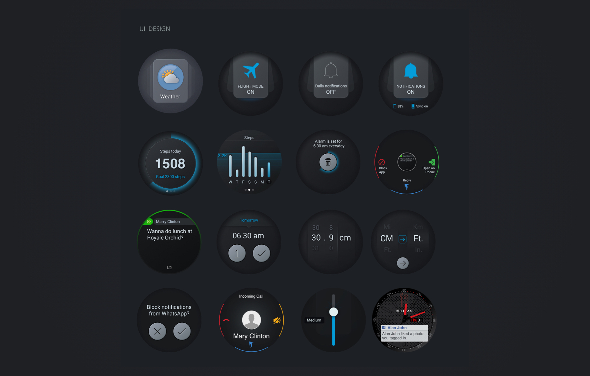
A peek into the visuals
Here are a few task flows:
Delivery
Teamwork matters
Due to the sheer size of this project, I needed to have everything figured out before the teams committed to development work. Heavy documentation is the key to success in such circumstances.
Karen from my team helped me in this stage. She chipped for visual design and design documentation to prep for development. We shared the project on two separate platforms- Android and iOS with the help of two different sets of developers.
We took module by module and shared the designs incrementally. I am very grateful for David’s timely approval without which meeting the deadlines would have been close to impossible.
Launch
A unanimous win
The hugely anticipated day finally arrived. In May 2016, the new Customer link launched in Taiwan and some parts of Europe. It was lauded by the entire team and all the stakeholders involved as it was an impressive achievement, considering that it was a complete design and build from scratch.
An overwhelming success
The design received raving positive feedback from everyone and was a huge win in Taiwan.
As you can see, all their challenges had been tackled and yet another real-world problem had been solved through intuitive user design. I was beaming with satisfaction as that was the exact point behind all the hard work.
My learning
Workshops vs Interviews
Observing real users is very critical. Though in some cases, getting an informed opinion from experts in the team could also work.
Hence, it is important to ask the right questions to the stakeholders which would help frame the right problem statements, which would in turn enable designing solutions.
Continues improvement
A design is never really ‘complete’, it is dynamic. And that is why designing for volatility is very important. Requirements will constantly change as a business grows and that’s why it is important to keep tweaking as you go.
The lesser, the better
One of the key things to remember when designing visual topologies is to ONLY highlight and emphasize what is important. As a designer, our responsibility lies in creating clutter-free eye-catching visuals. Therefore, to engage the user’s attention and for easy comprehension, stick to the ‘less is more’ philosophy and project only the important information through the use of written content or infographics.
Introduction
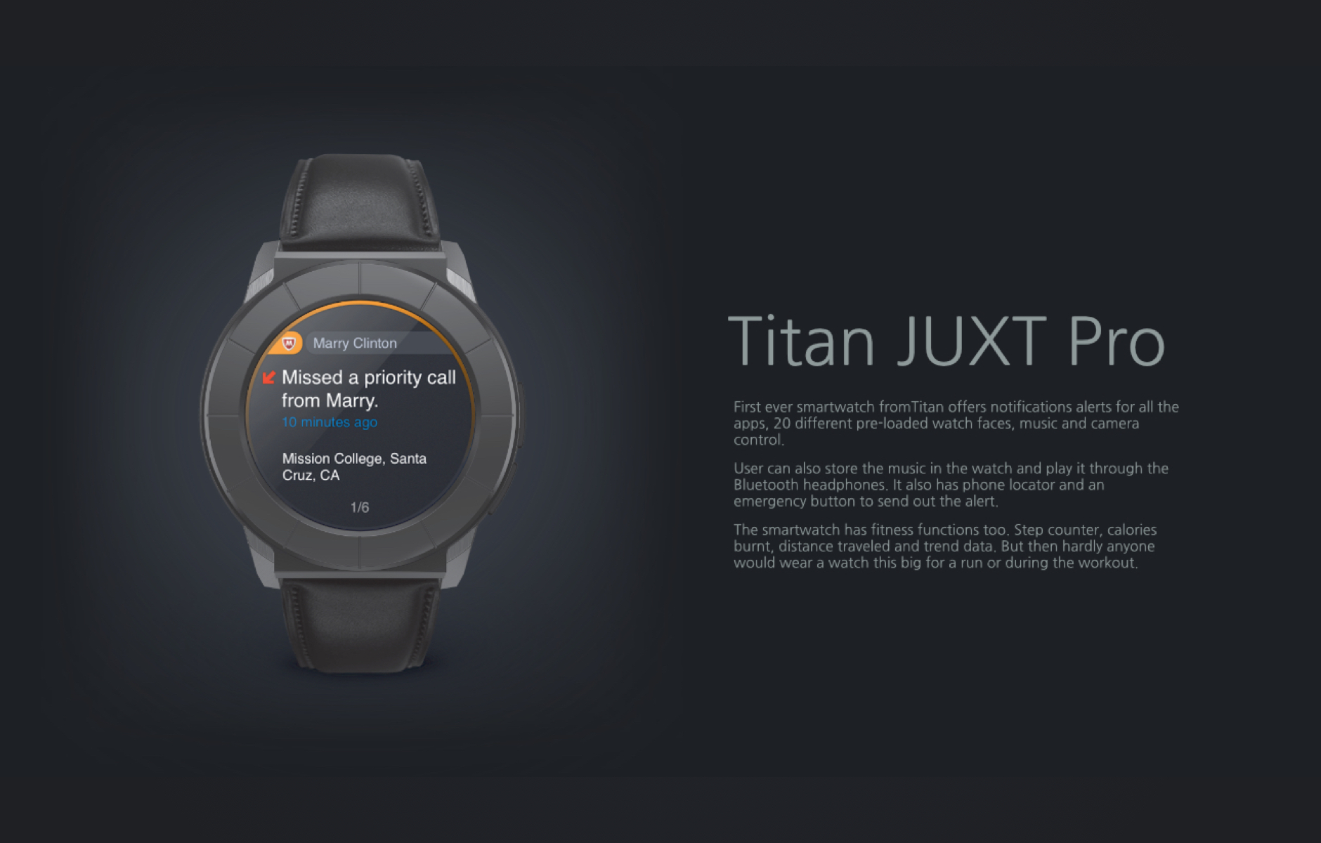
Titan JUXT Pro
Titan Juxt Pro is a Circular shaped Smartwatch that comes with a strap. It features a 1.3-inch display that comes with a screen resolution of 360 x360 pixels.
The smartwatch is equipped with smart features that let you stay motivated with your fitness goals, store & play music, snap a picture with just a tap, access notifications, find your missing phone, and a lot more.
My Role
I was the UX Lead along with a Visual Designer and Design Manager, with whom I collaborated in this project. I was part of the project from the initial meetings until the handover of the project to Titan.
T V Commercial
Case study coming soon...
Mobile Apps
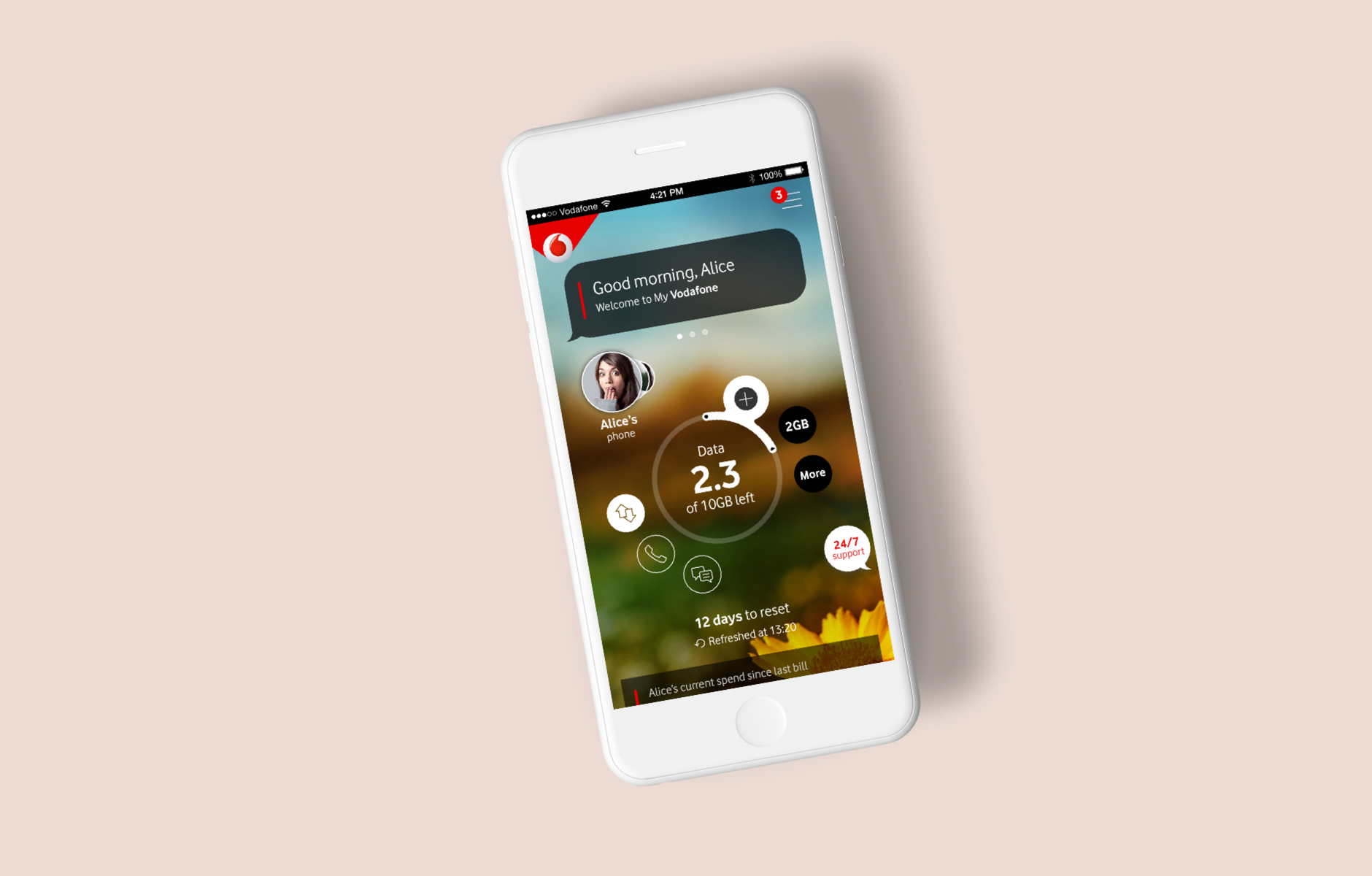
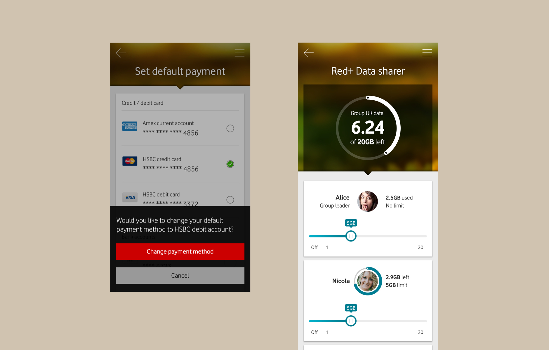
My Vodafone
Year : 2017
Role : Team member, Visual Design
My Vodafone is an easy way to manage their user's account straight from their smartphone. Users will be able to check the balance of credit, calls, data, and SMS. Users also can get access to various other services provided by Vodafone. The app had released in 22 operating countries.
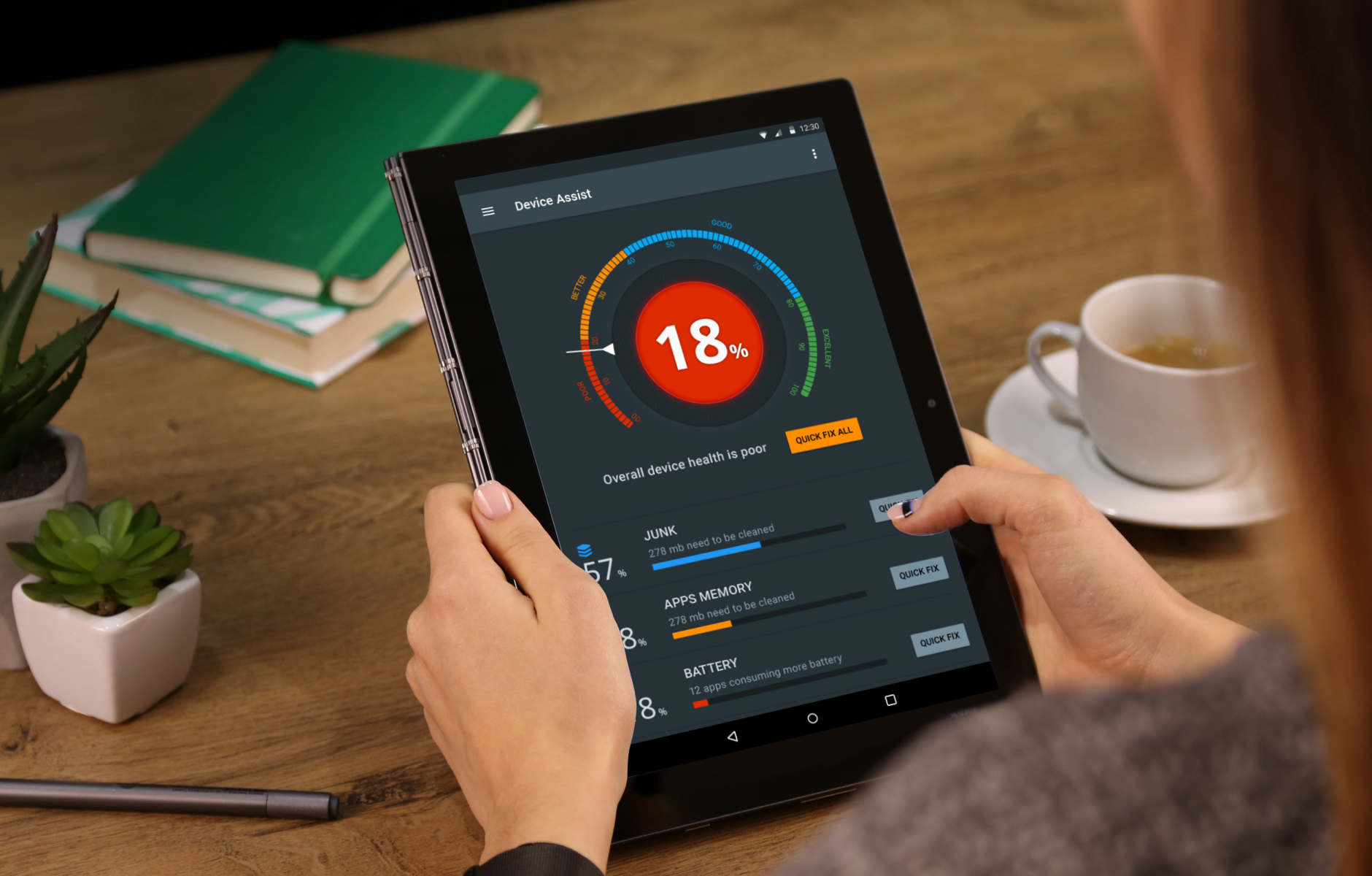
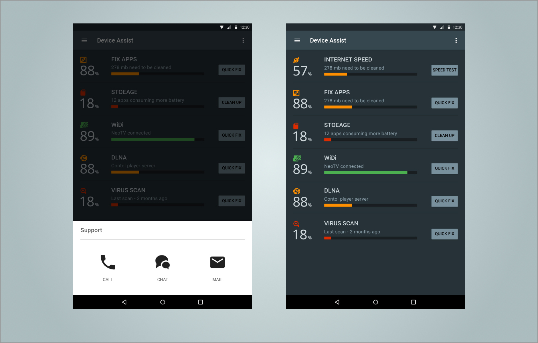
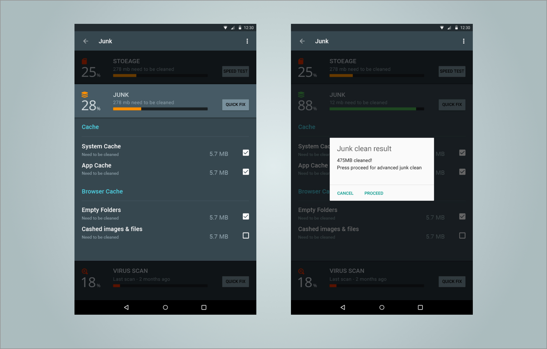
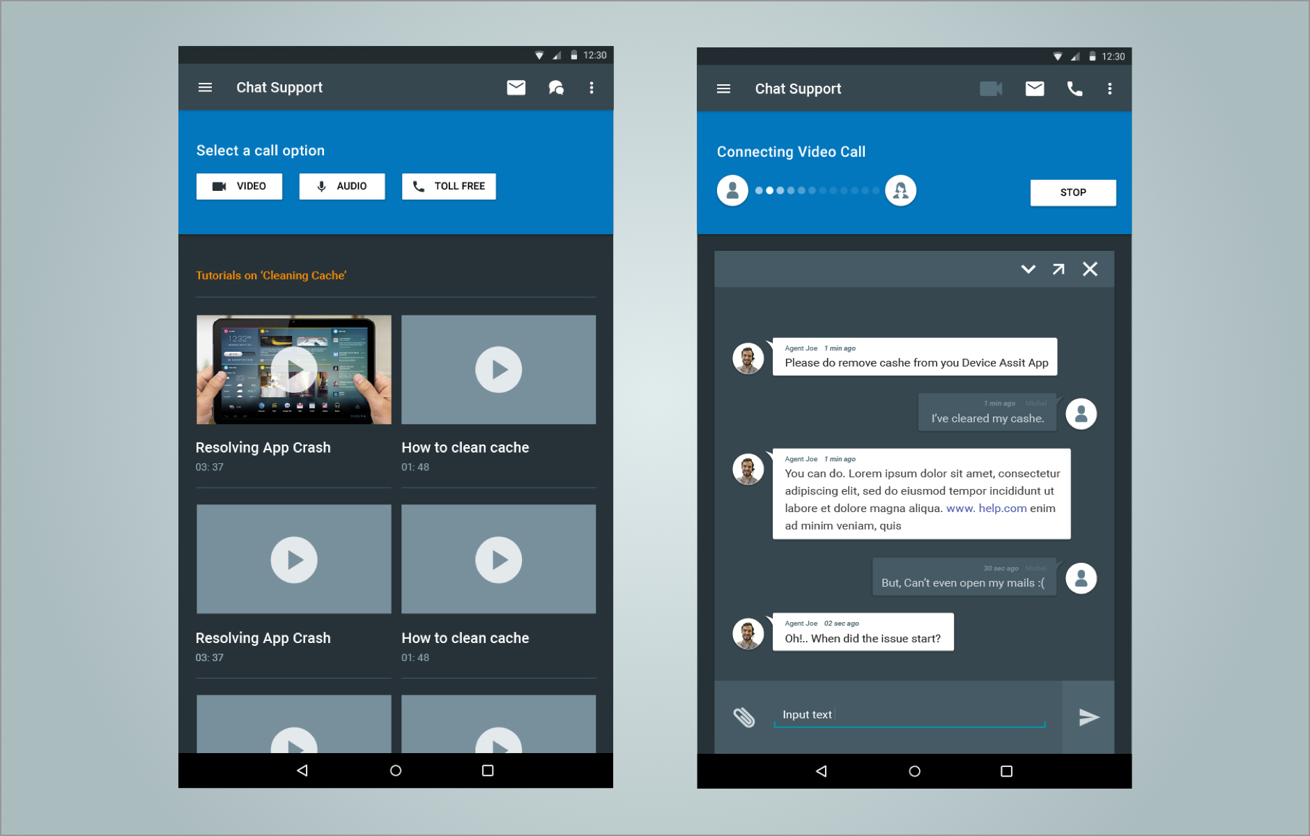
Intel Device Assist
Year : 2015
Role : Team member, User Experience
Intel Device Assist is a mobile application which is working quietly behind the scenes to keep user's mobile device safe and healthy. The customer support feature enables the user to diagnose the device issues by interacting with the agent through chat, video, e-mail, and telephone support.
Web Apps
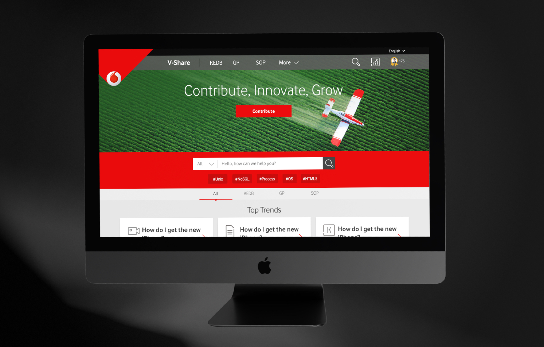
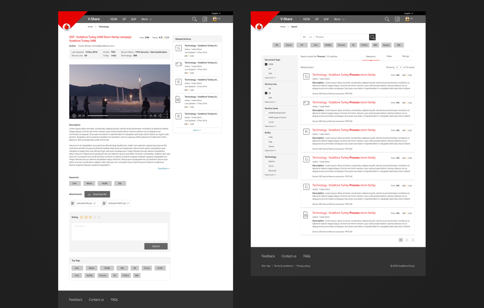
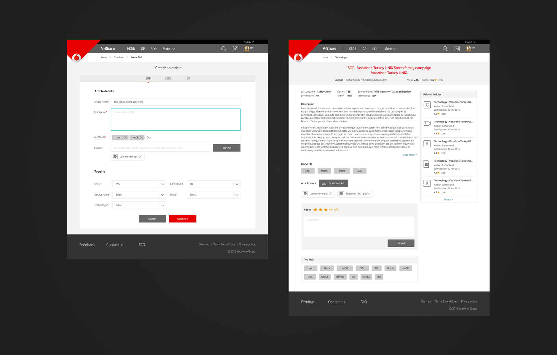
Vodafone V-Share
Year : 2017
Role : Lead, User Experience
Traditionally the developers at Vodafone browse through various platforms to seek help. V Share address this issue and created a platform for Vodafone employees to interact and share their knowledge across the organisation.
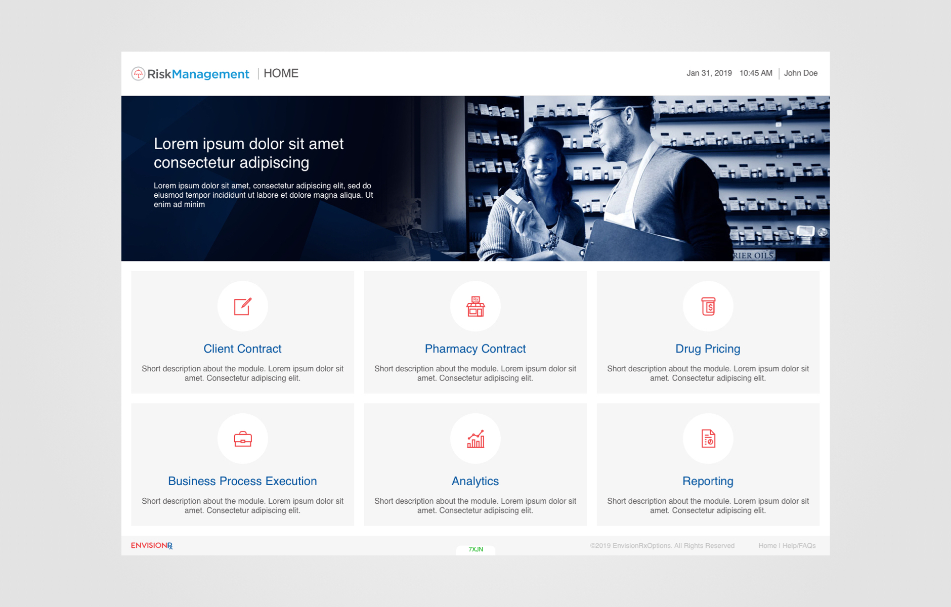
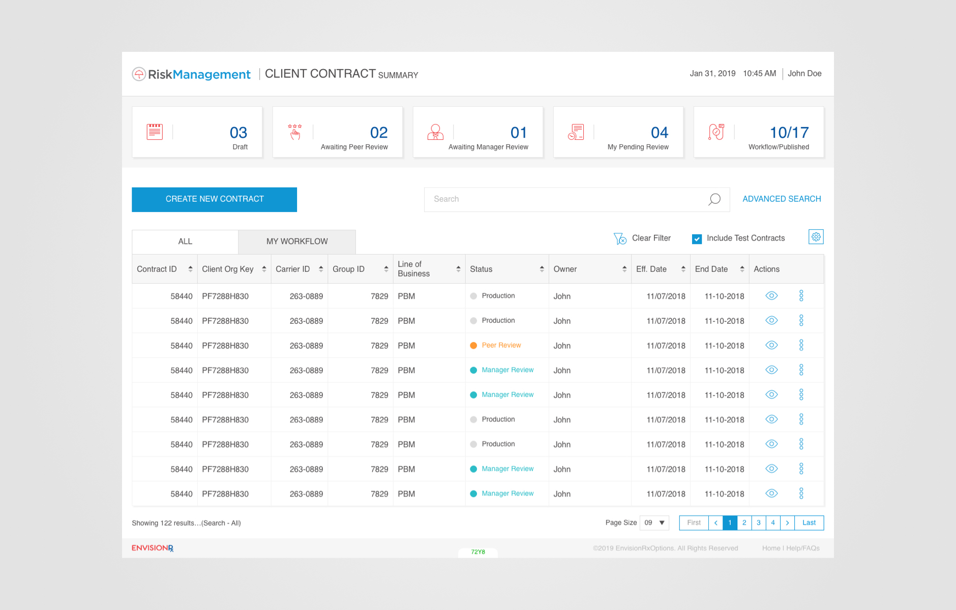
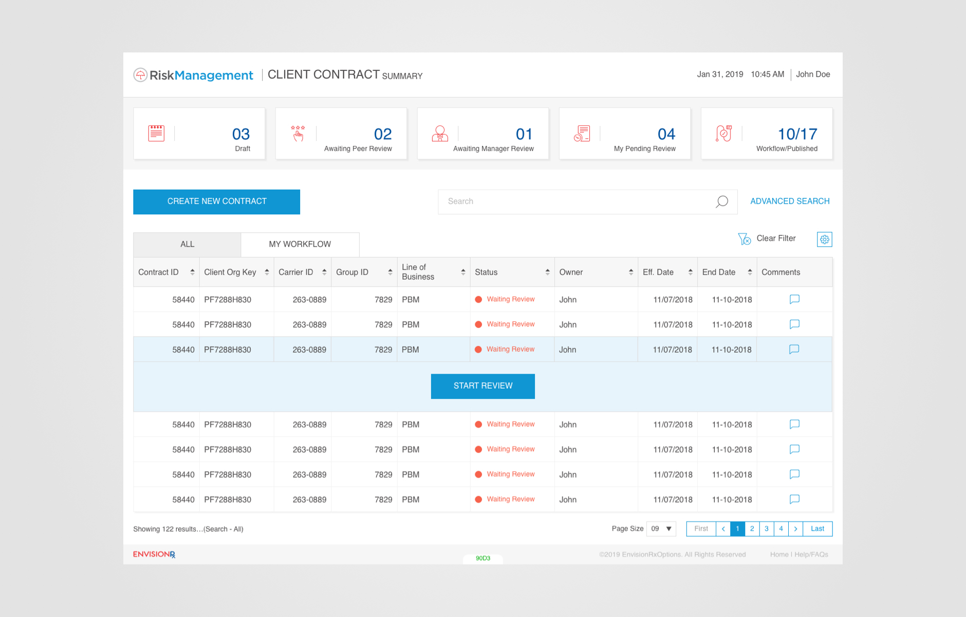
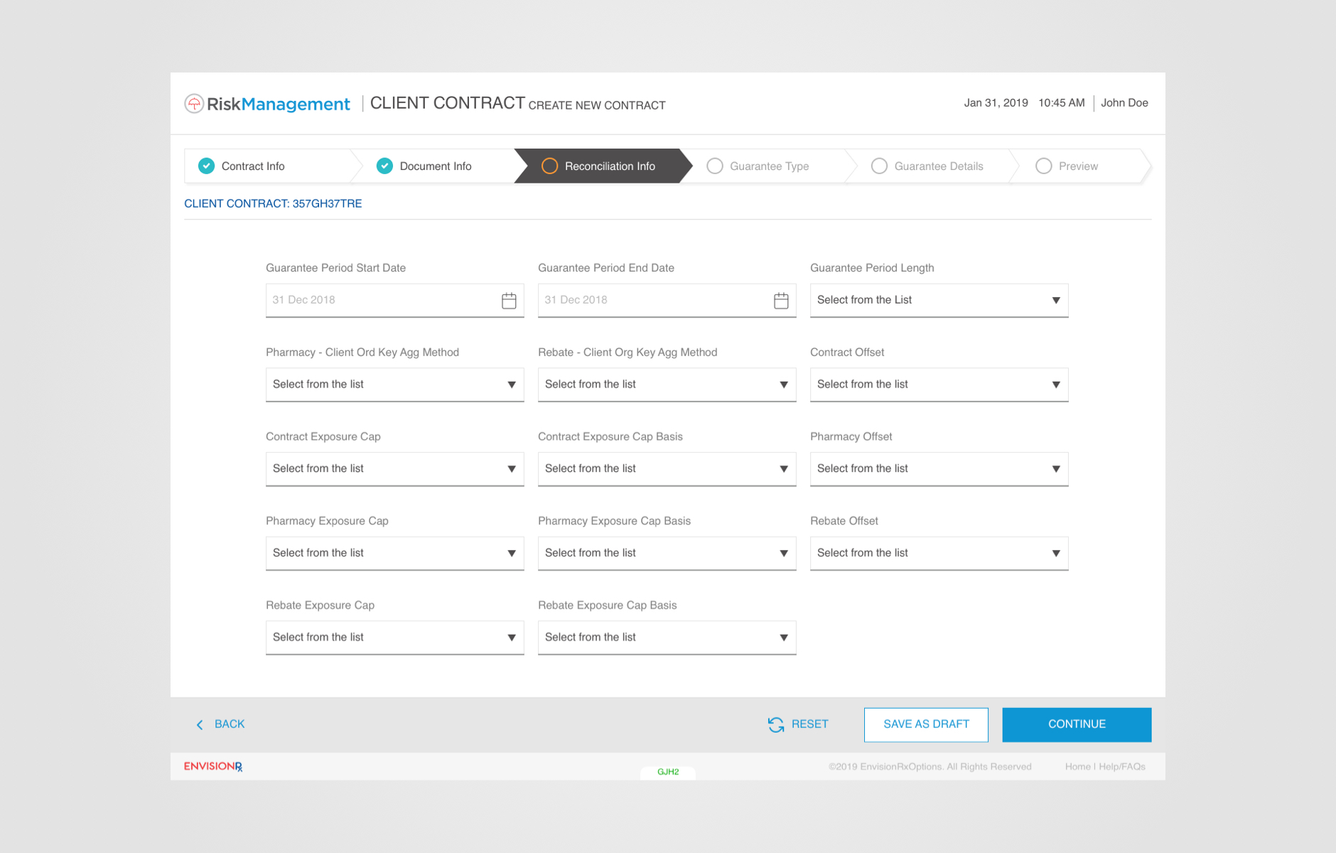
Envision Rx
Year : 2018
Role : Lead, User Experience
EnvisionRx wants to have a single shared data source Risk Management Platform for many of its departments. The tool is used for the sharing of data and the calculation of impact. The goal of the web-based tool is to identify, manage and report on the risk associated with under/over performance guarantees.
Facebook Apps
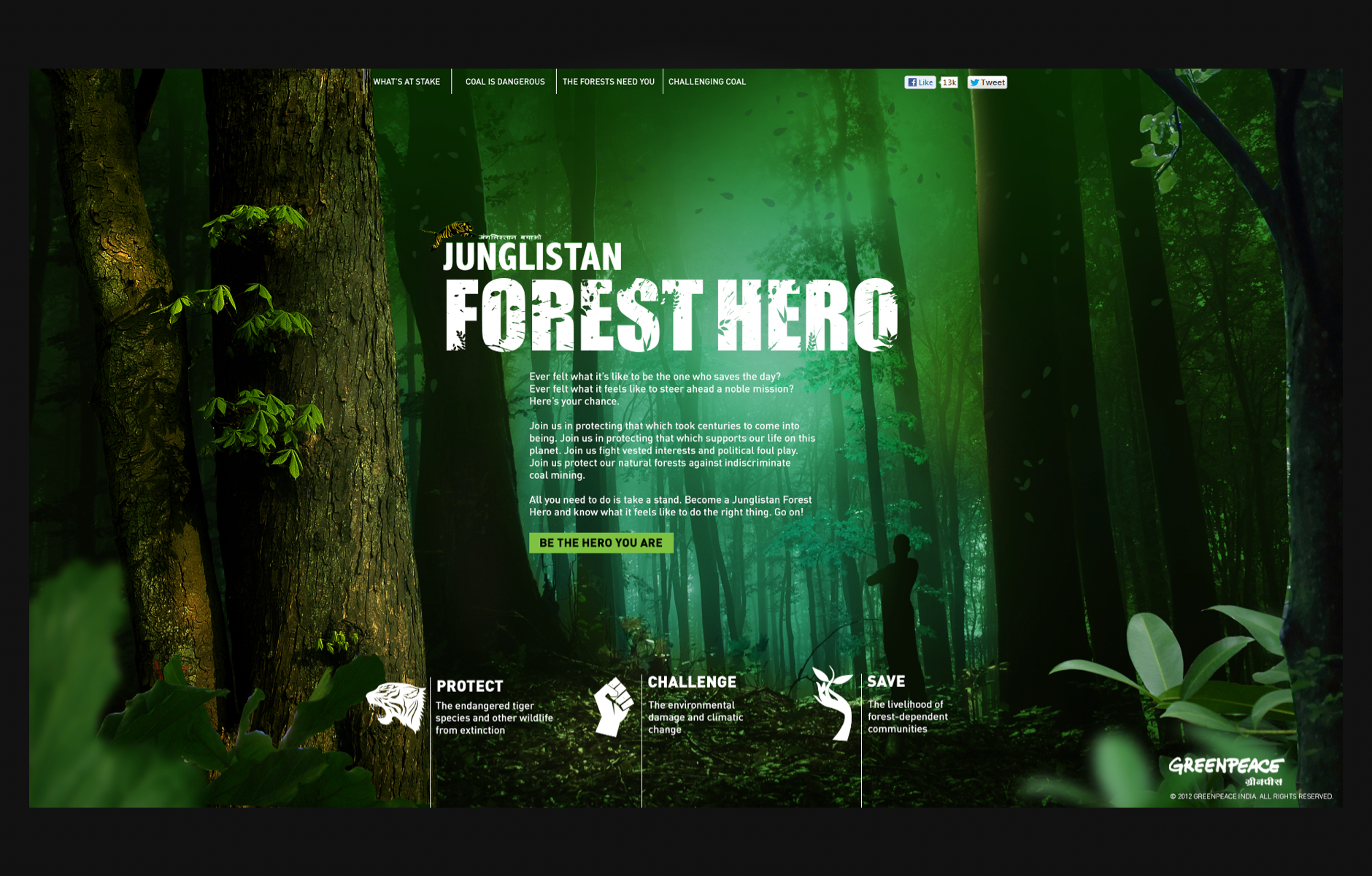
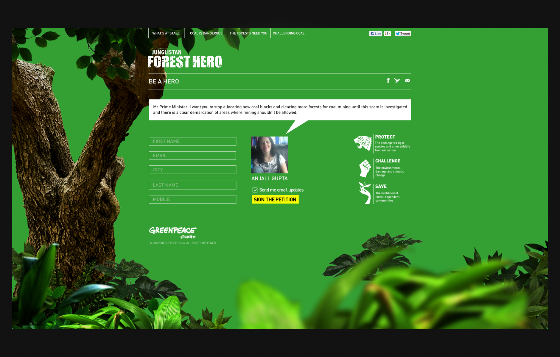
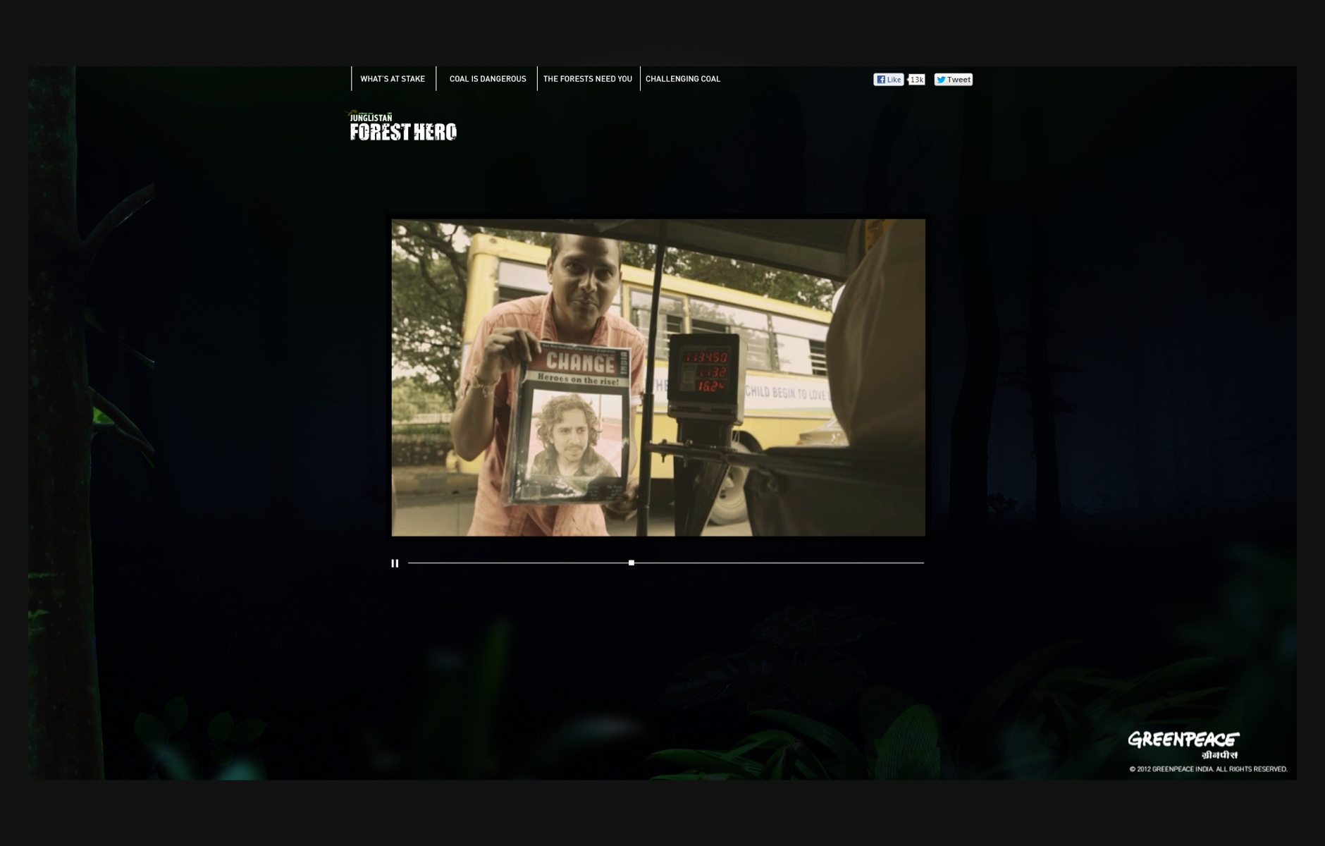
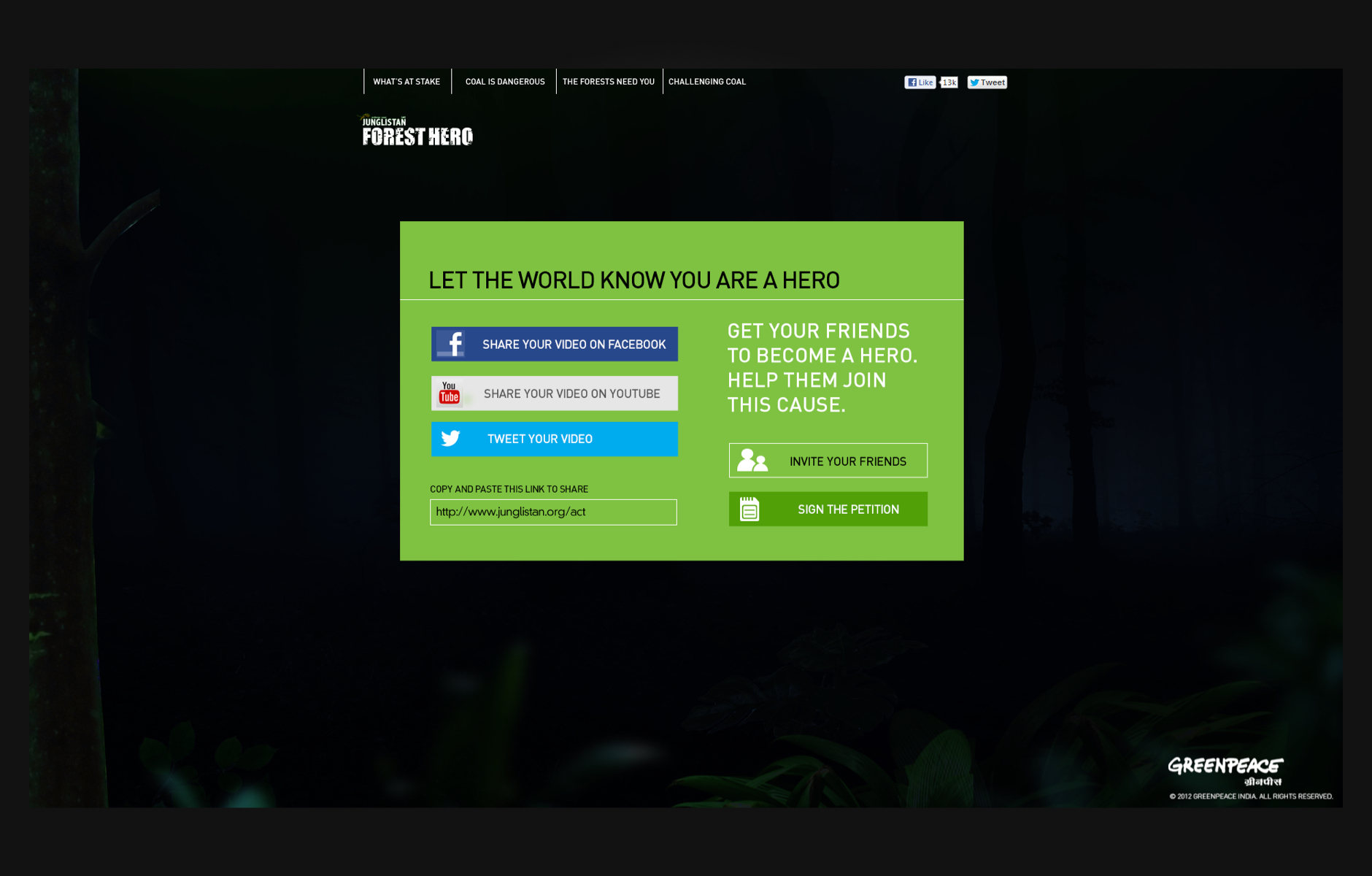
Greenpeace Forest Hero
Year : 2014
Role : Creative Head
'The Forest Hero' online campaign is in connection with Green Peace India's offline campaign that aims to help create awareness about forest destruction from coal mining in India and to gather popular support using Social Media.
Greenpeace India has released an innovative Facebook application with a personalised video to engage its social media audience. The campaign runs on both, micro-site as well as its Facebook application.
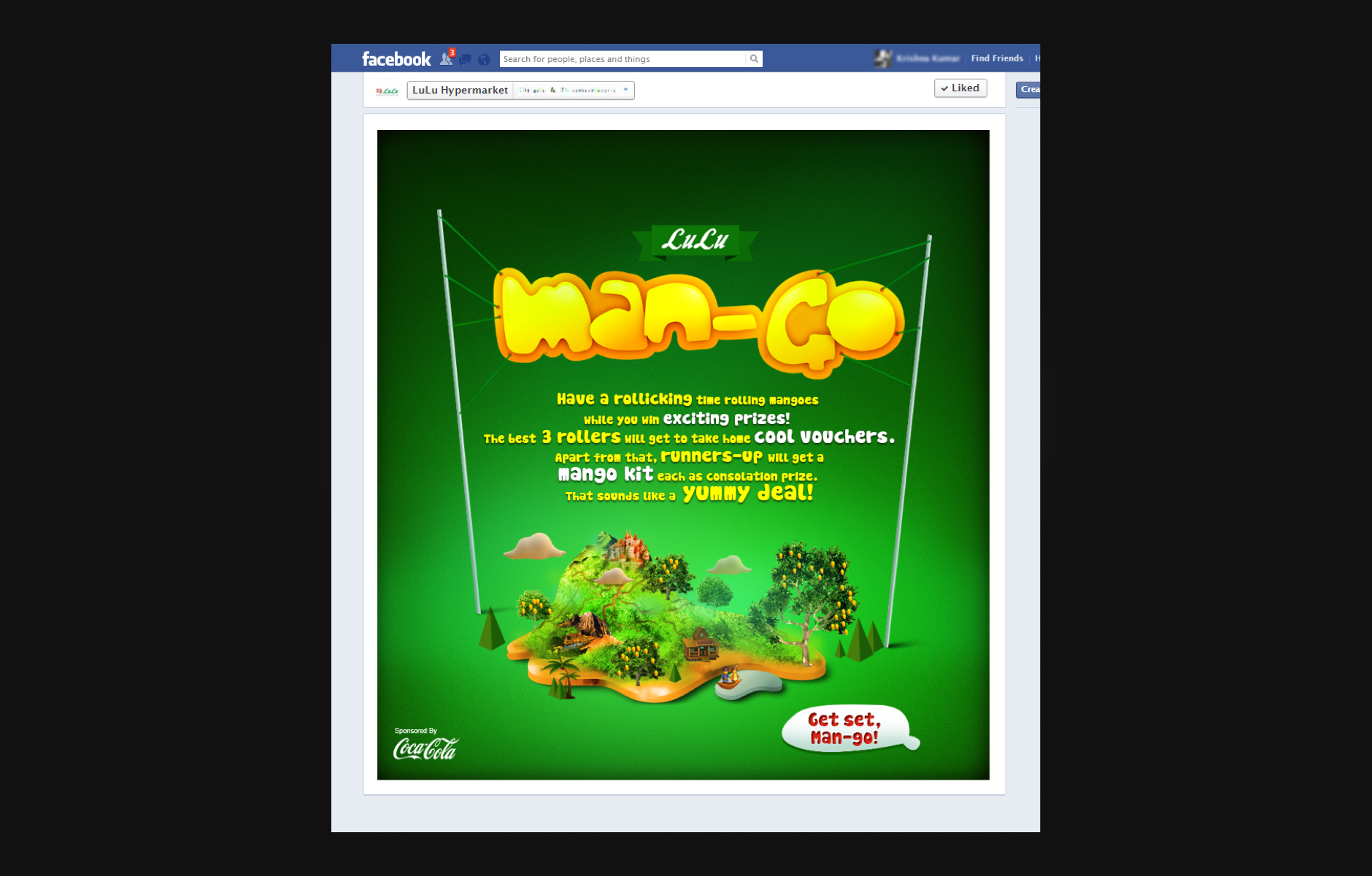
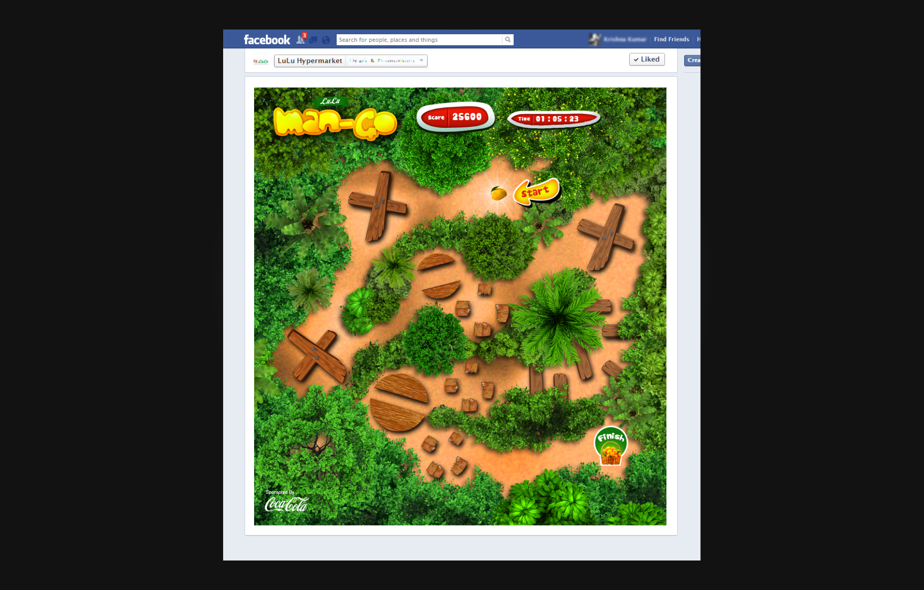
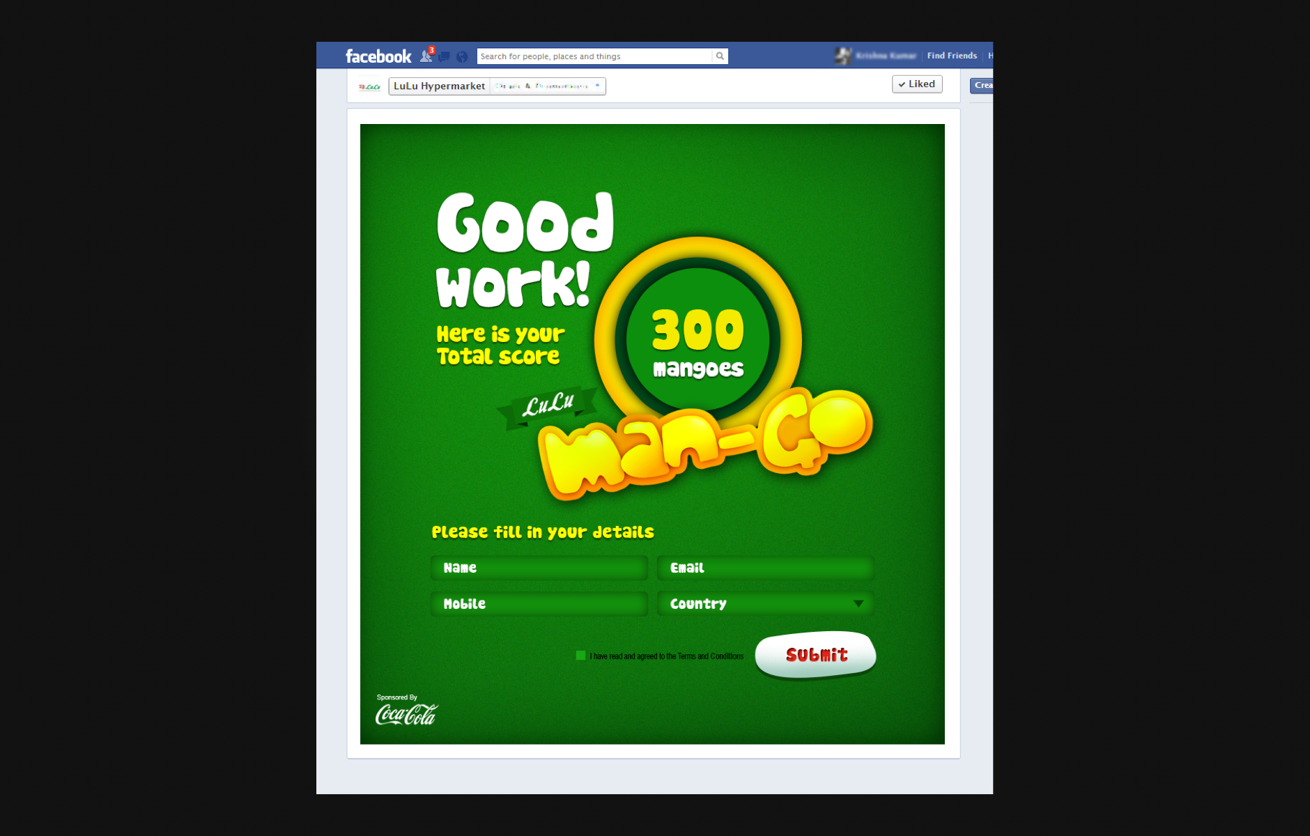
Lulu Man-Go
Year : 2013
Role : Creative Head
On the occasion of the mango festival season, LuLu Hypermarket UAE approached us to create an engaging game for Facebook fans.
We build an interesting game, The user has to roll the mango through a forest with obstacles without damaging it by touching anywhere apart from the specified path. The one who takes the lesser time to make it to the target will win.
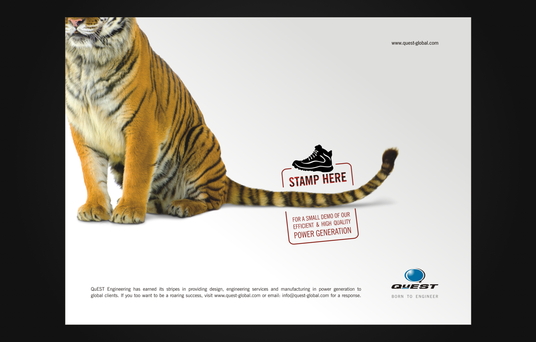
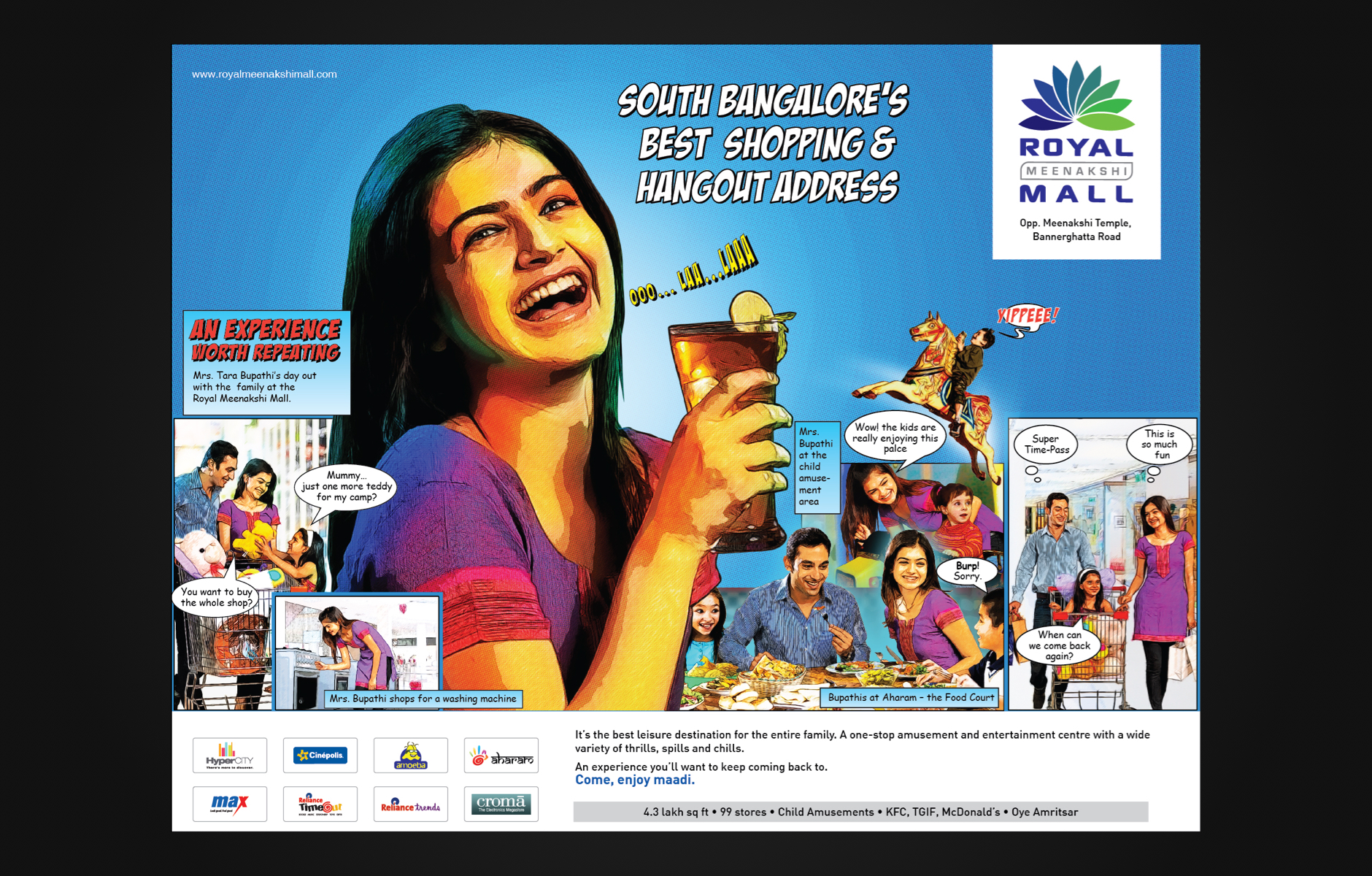
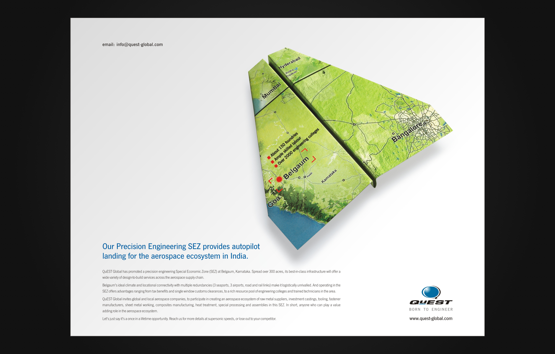
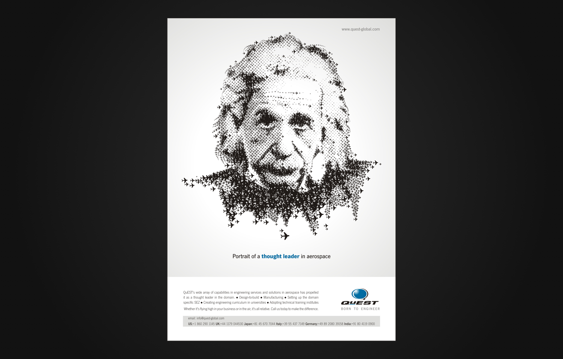
Branding and Advertising
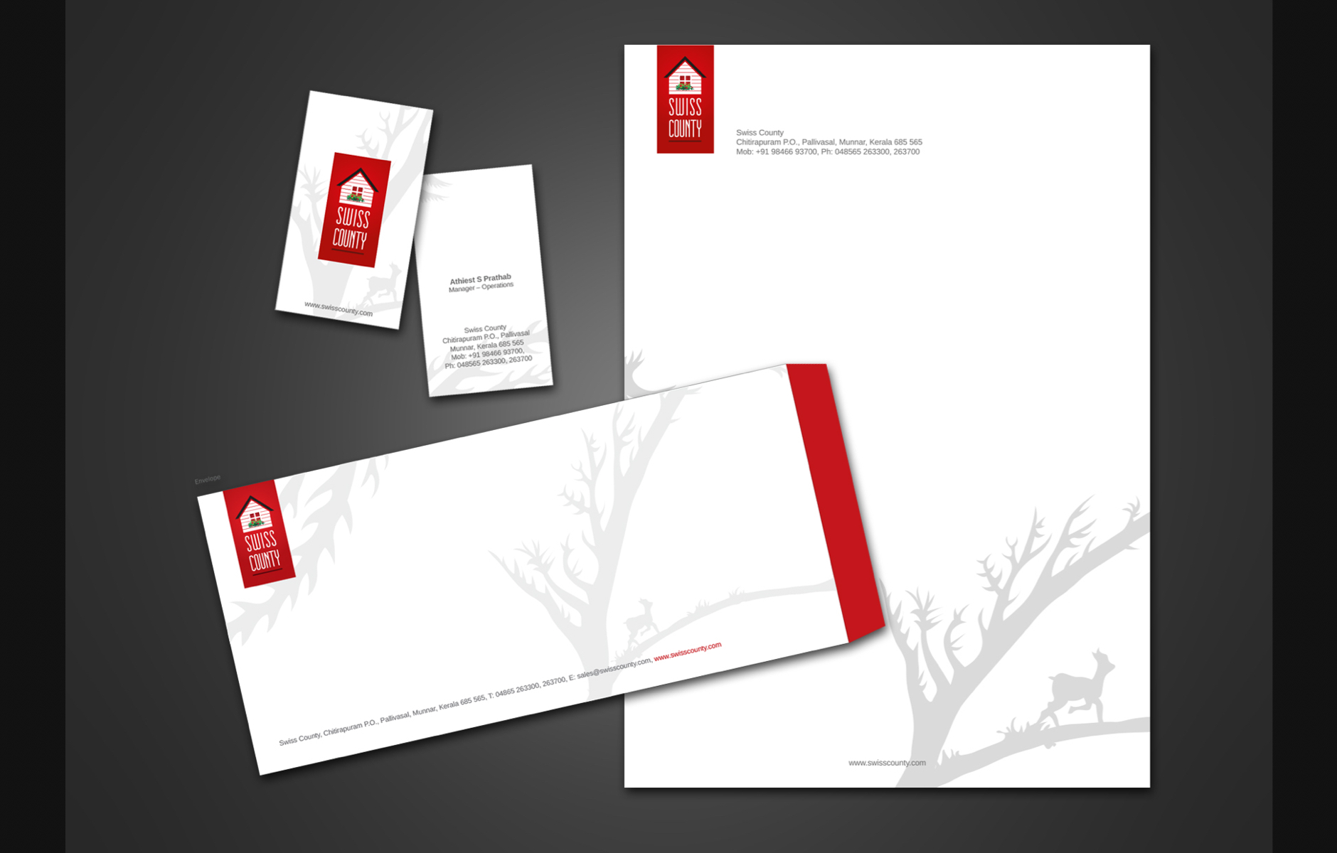
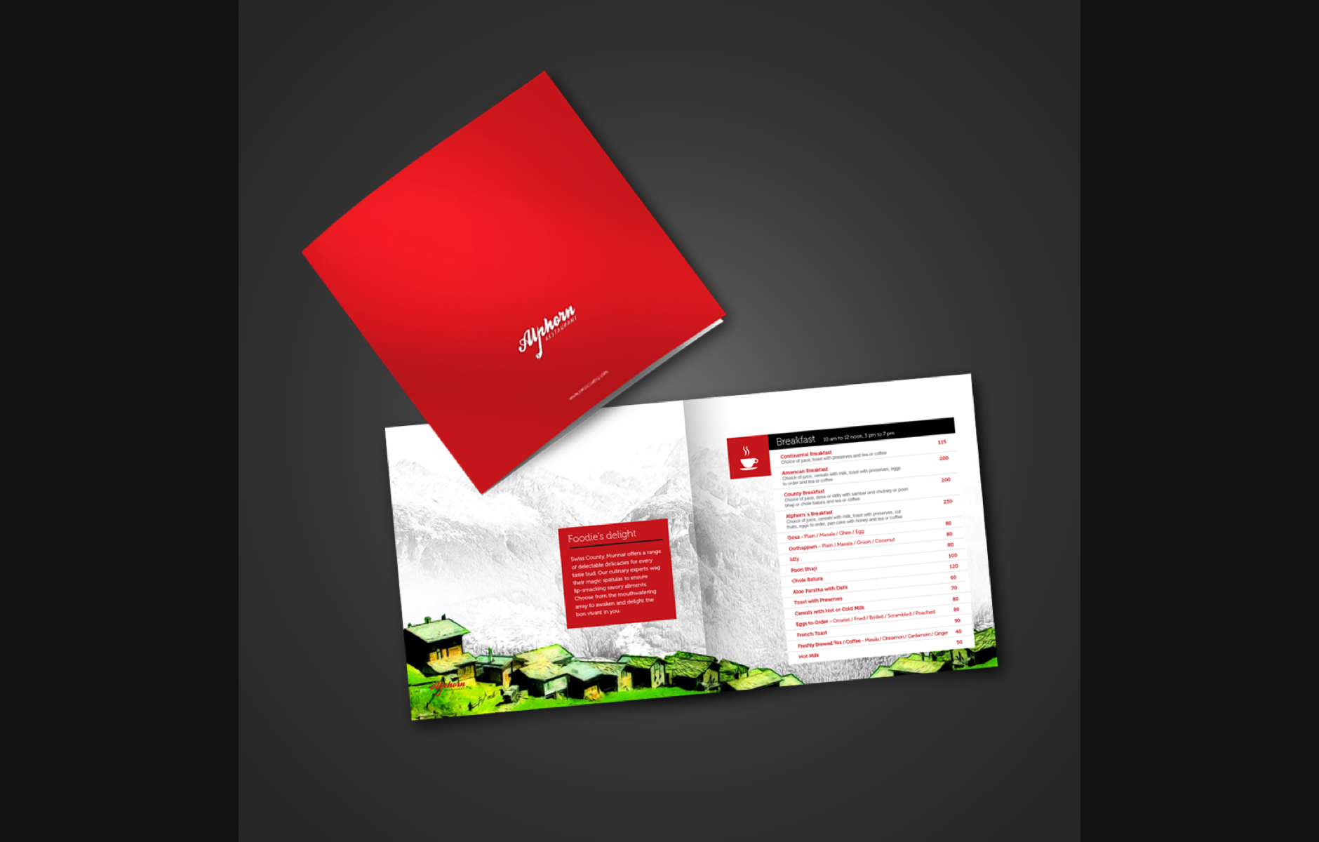
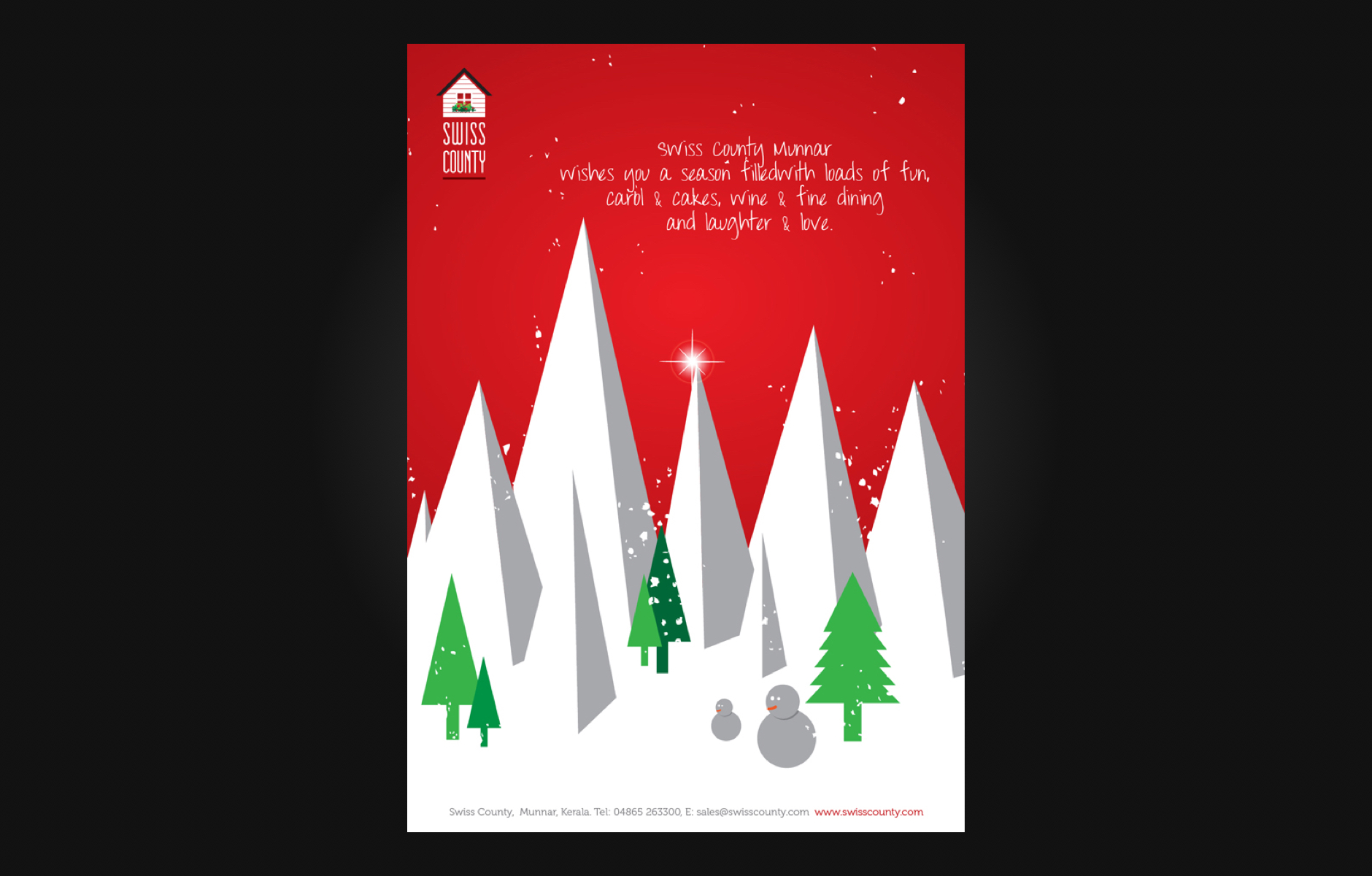
Swiss County Resort
Year : 2012
Role : Senior Art Director
Swiss County is a small, boutique property located to the south of the hill station of Munnar. I've worked with the investor to frame its branding and digital advertising strategy.
Advertising Campaigns
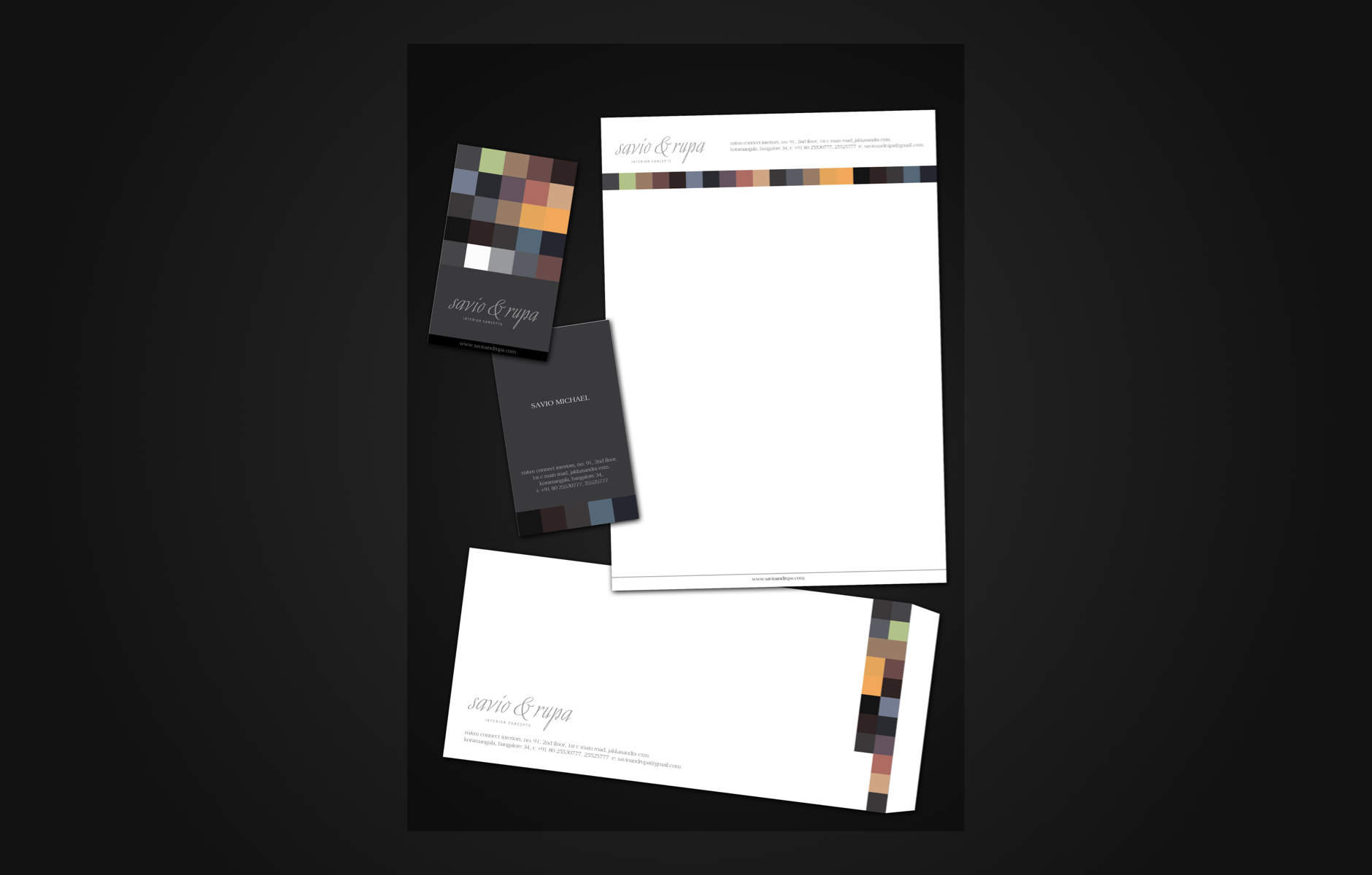
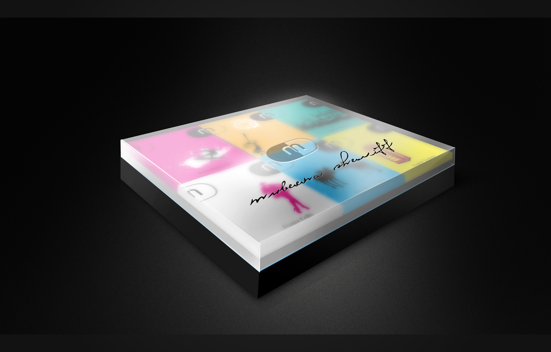
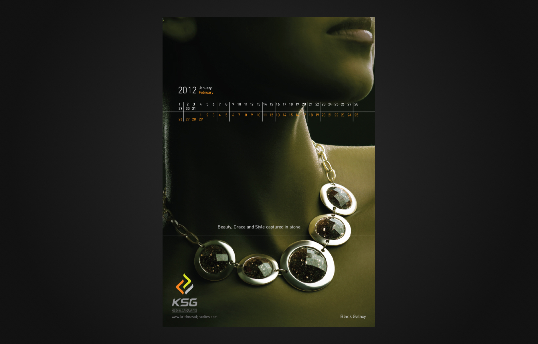
Year : 2008 - 2012
Role : Art Director
Spending my initial years in M&M connect, an advertising agency located in Bangalore. With the help of my experienced mentors, I polished my skills in design, illustration, photography, animation, and digital art direction.